Avineon Tensing
Shaping geospatial intelligence
Brand Strategy
Brand Identity
Logo Design
The Challenge
Avineon Tensing is a leader in geospatial intelligence. Put simply, they turn complex data into clarity and direction, giving organisations the insight they need to make informed decisions. Formed through the merger of Avineon (US) and Tensing (NL), the company brings together deep technical expertise with the mindset of thinkers, builders and connectors. With a solid strategy already in place, they were ready for the next step. They wanted to unite under a new brand that reflects their shared mission and ambition.
Default
Two legacies, one identity
Following the merger, Avineon Tensing operated with two strong legacies but without a clear visual identity. Initially, they planned to take on the redesign of their website themselves, but soon the task proved bigger than anticipated. To carry their story forward, they needed a clear, integrated repositioning to express their brand as one entity. The challenge was to create a visual identity that speaks to the equal partnership between both organisations. Logo, colour system, graphic language and content outlines all had to be designed in a way that honoured the existing strategy and preserved both brands’ recognition.
Default
Unified, balanced & future-proof
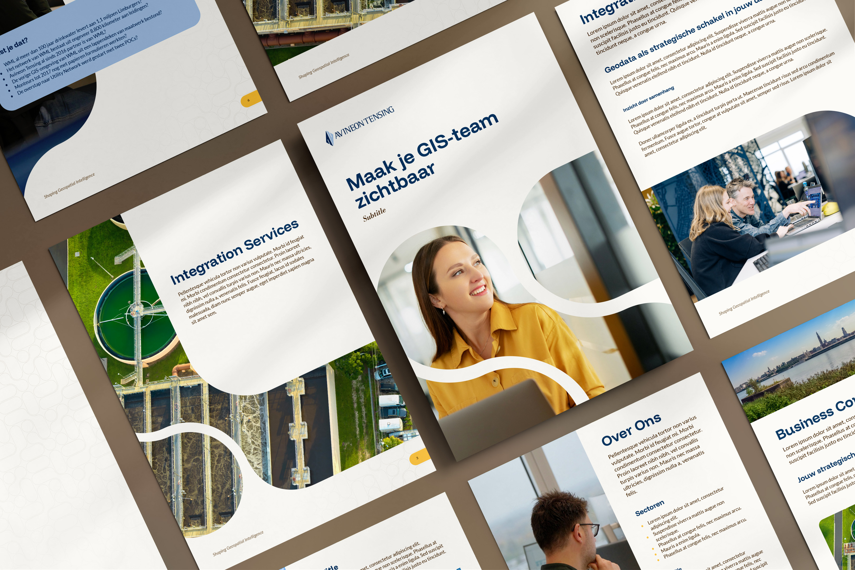
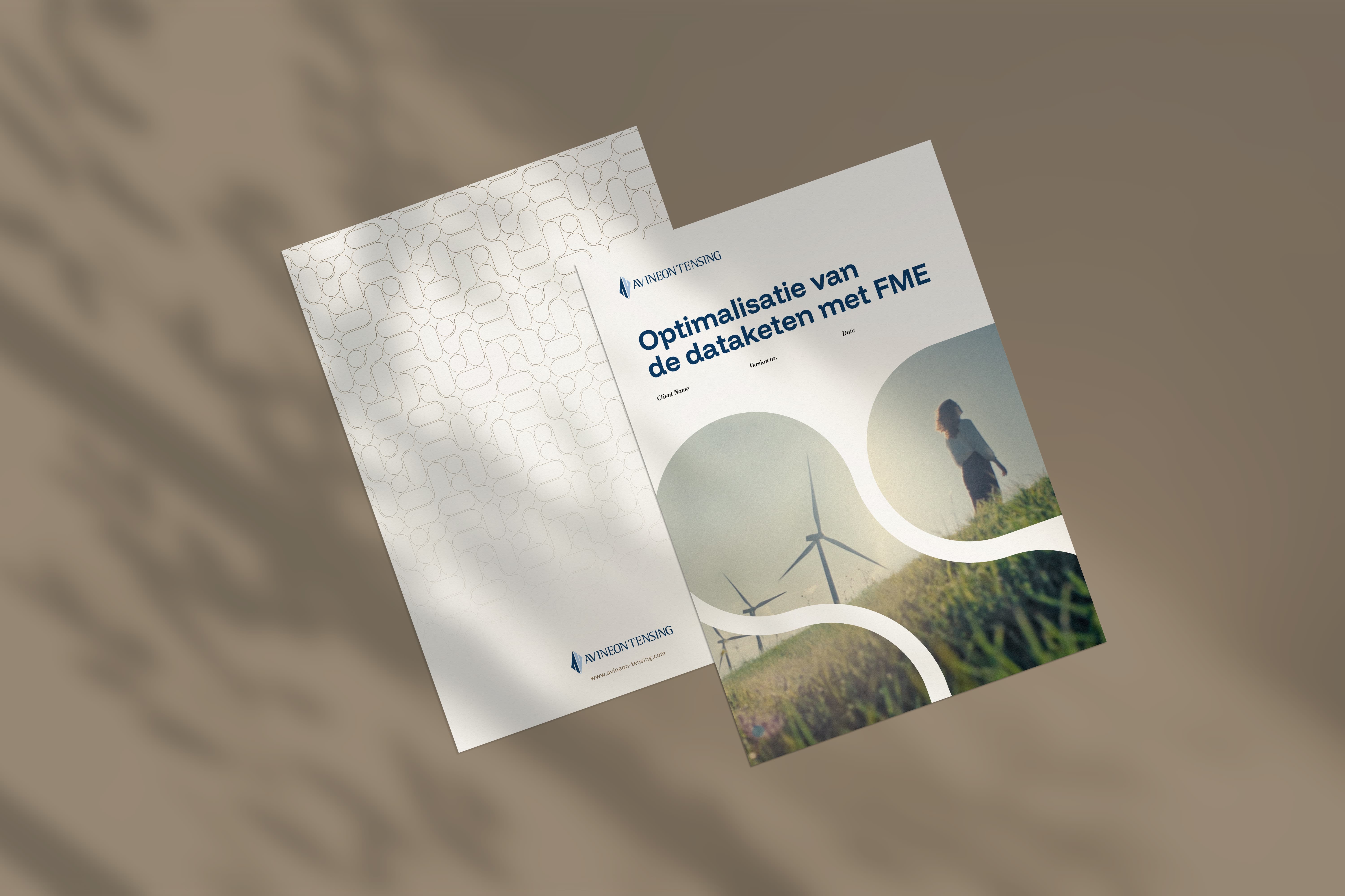
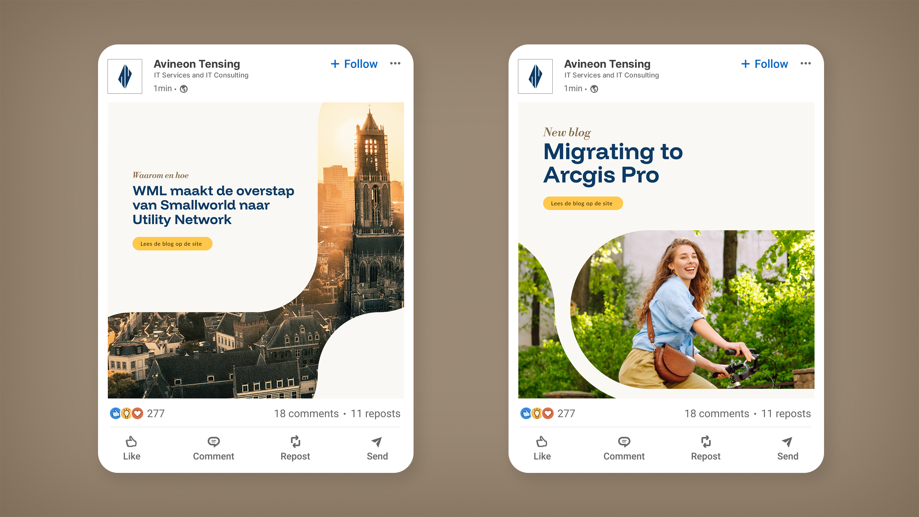
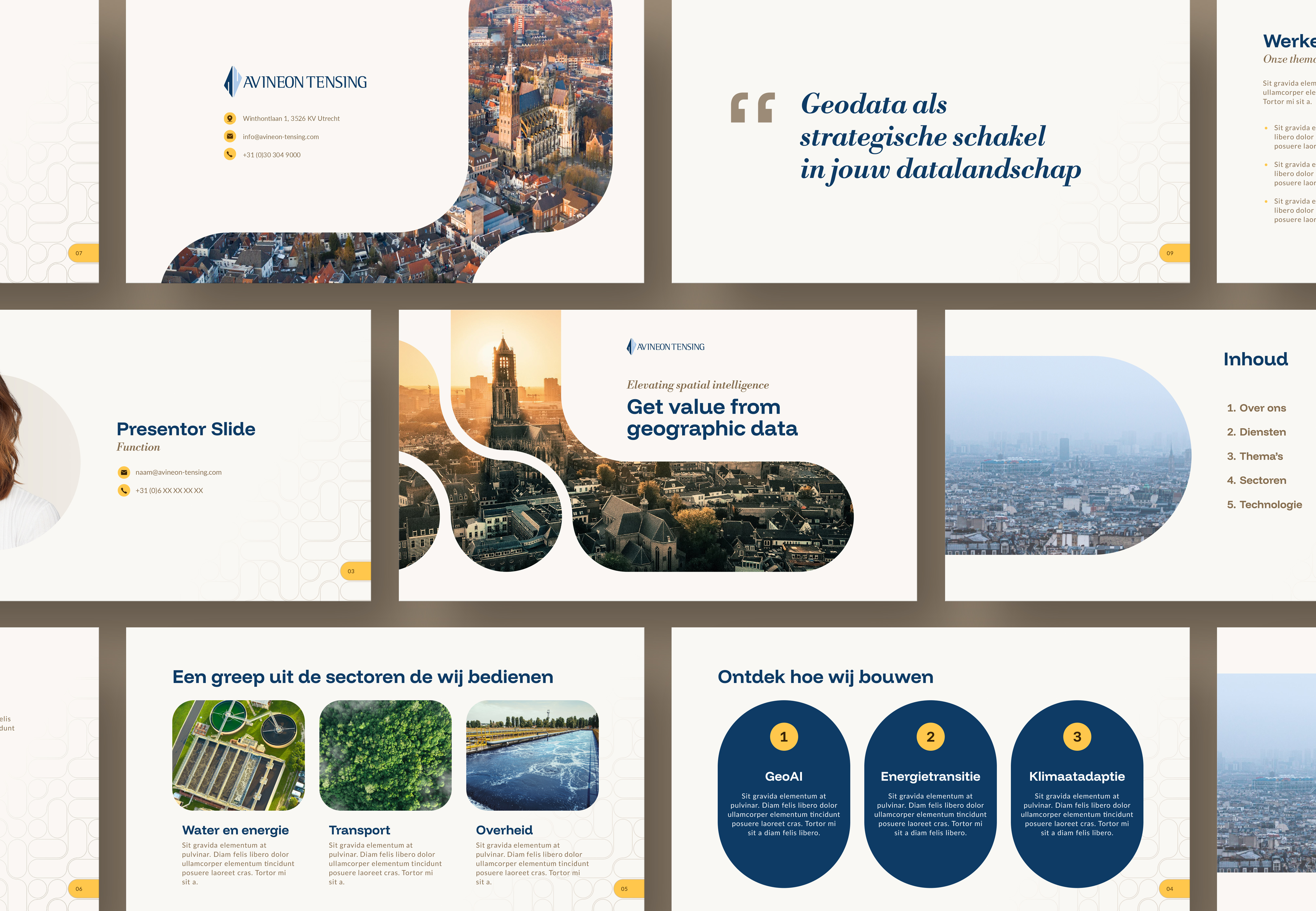
Building on their strategic foundation, we translated Avineon Tensing’s brand story into a complete, future-proof identity. First, we refined and unified the existing double logo into a single wordmark without separation - clear, balanced and universally applicable across all digital and physical touchpoints. Next, we developed a new design system, using a coherent colour palette and graphic elements rooted in geospatial movement. We also created a content framework that reflects their clarity-driven mission. The new identity was then carried through into brand guidelines, content development and a design blueprint for the new website, created in collaboration with a development partner.
1159247029
Default
1159246977,5
G1
Decisive effect
The visual change may appear modest at first glance, but the effect was decisive. The unified logo marks the moment when two respected organisations become one. Within the organisation, it reinforces their shared identity, externally it signals professionalism, stability and direction. The new brand design gives Avineon Tensing a consistent, recognisable presence across all communications. Well-crafted and strategically aligned, it forms a solid foundation for future growth and ensures a clear and confident voice.
Default
-
Avineon Tensing
Smaac maker
The Avineon Tensing rebrand demonstrates our ability to build on a strong existing strategy and turn it into a compelling, cohesive brand identity. The process wasn’t always straightforward, but through clear thinking, creative problem-solving and close collaboration, we delivered an impactful solution that shows clarity and precision often outweigh reinvention.
Default
-
Avineon Tensing
No items found.


