LichtNL
Lighting the way as a strategic partner
Brand Strategy
Brand Identity
Logo Design
Website Creation
Strategic beacon in a crowded market
LICHTNL is a beacon in a crowded lighting market, where many suppliers deliver exactly what is asked. A strategic partner for architects and project teams, LICHTNL helps shape lighting from the very start of a project. Driven by the ambition to grow and a clear desire to add value earlier in the project lifecycle, they wanted to distinguish themselves from the standard supplier. Not by selling more products, but by becoming a partner for professionals who take lighting seriously.
Default
All lights on a clear idea
Despite their strong technical expertise, LICHTNL was seen as just another lighting supplier. Often overlooked by project leaders, architects and stakeholders who increasingly seek critical partners rather than compliant sales voices. The need is clear for a partner who thinks ahead, adds strategic value and takes responsibility beyond products alone. A role that fits LICHTNL perfectly, but they couldn’t credibly claim it yet. What was needed wasn’t a better spotlight, but a clearer idea of what should be in it.
Default
showcasing the shift
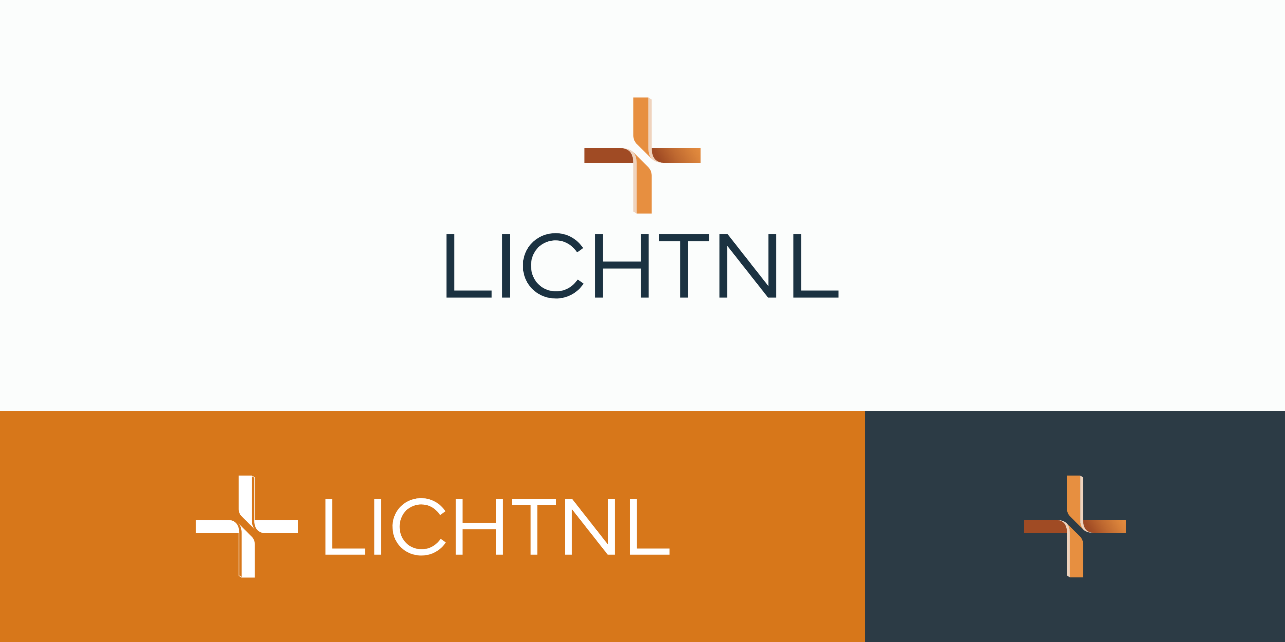
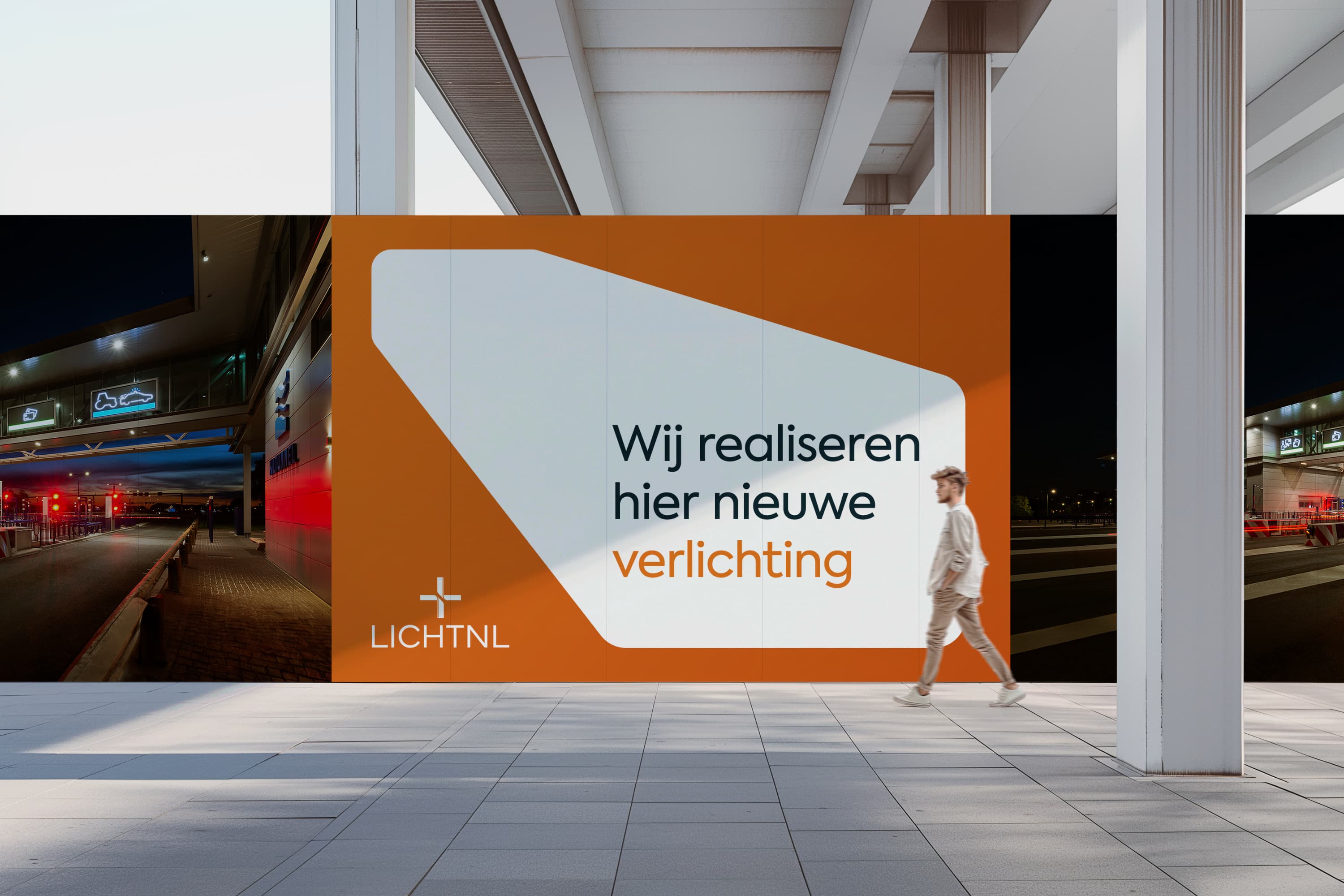
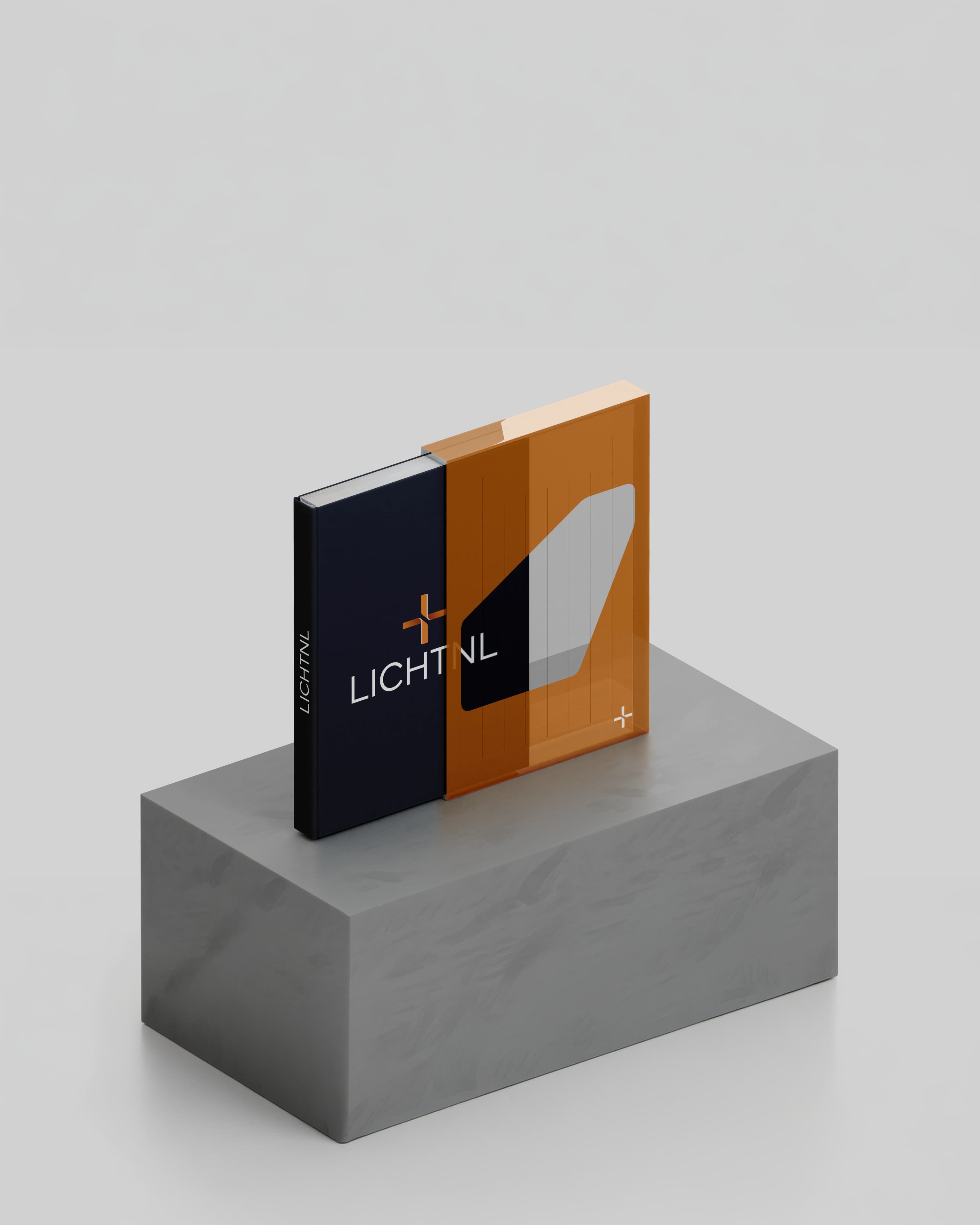
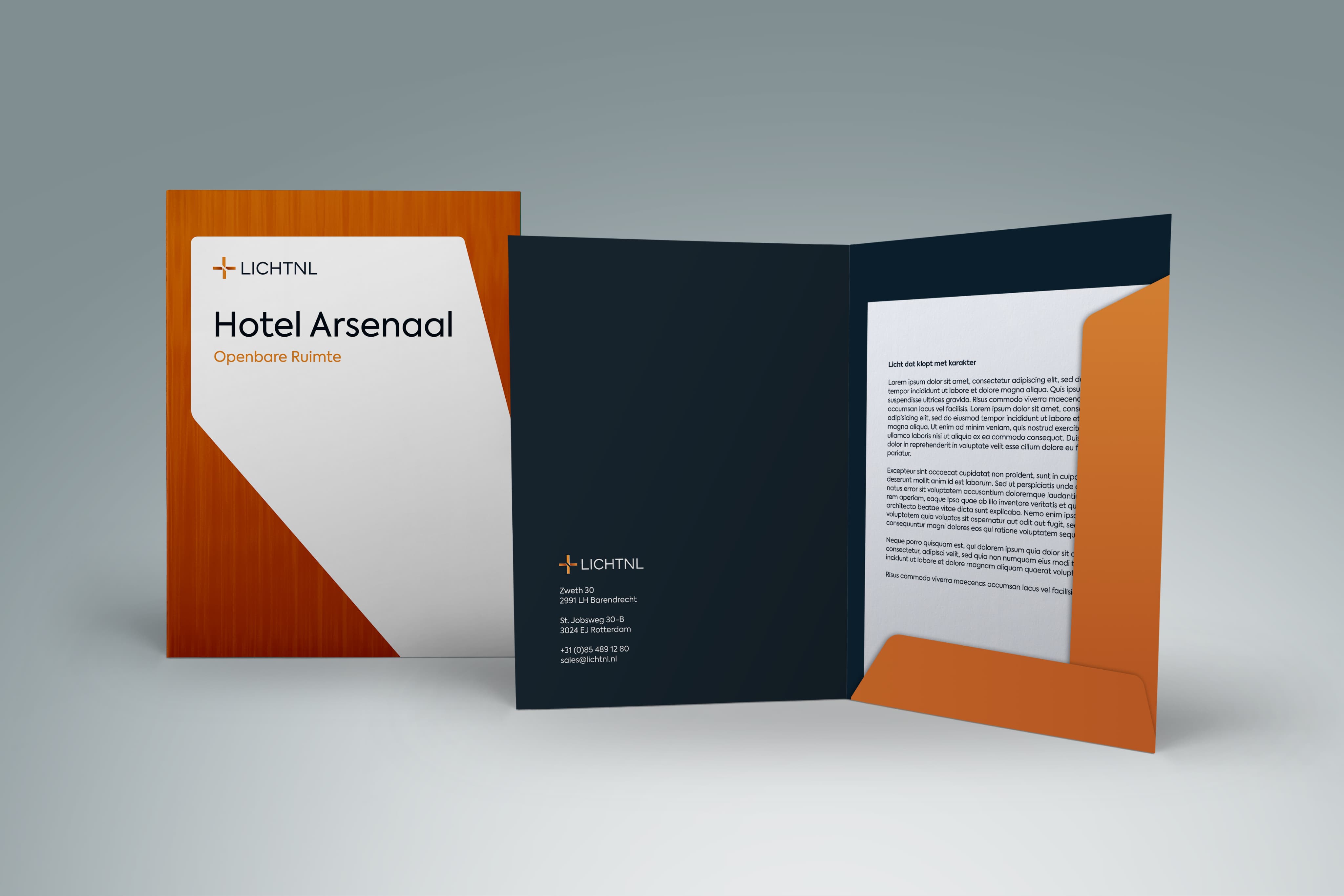
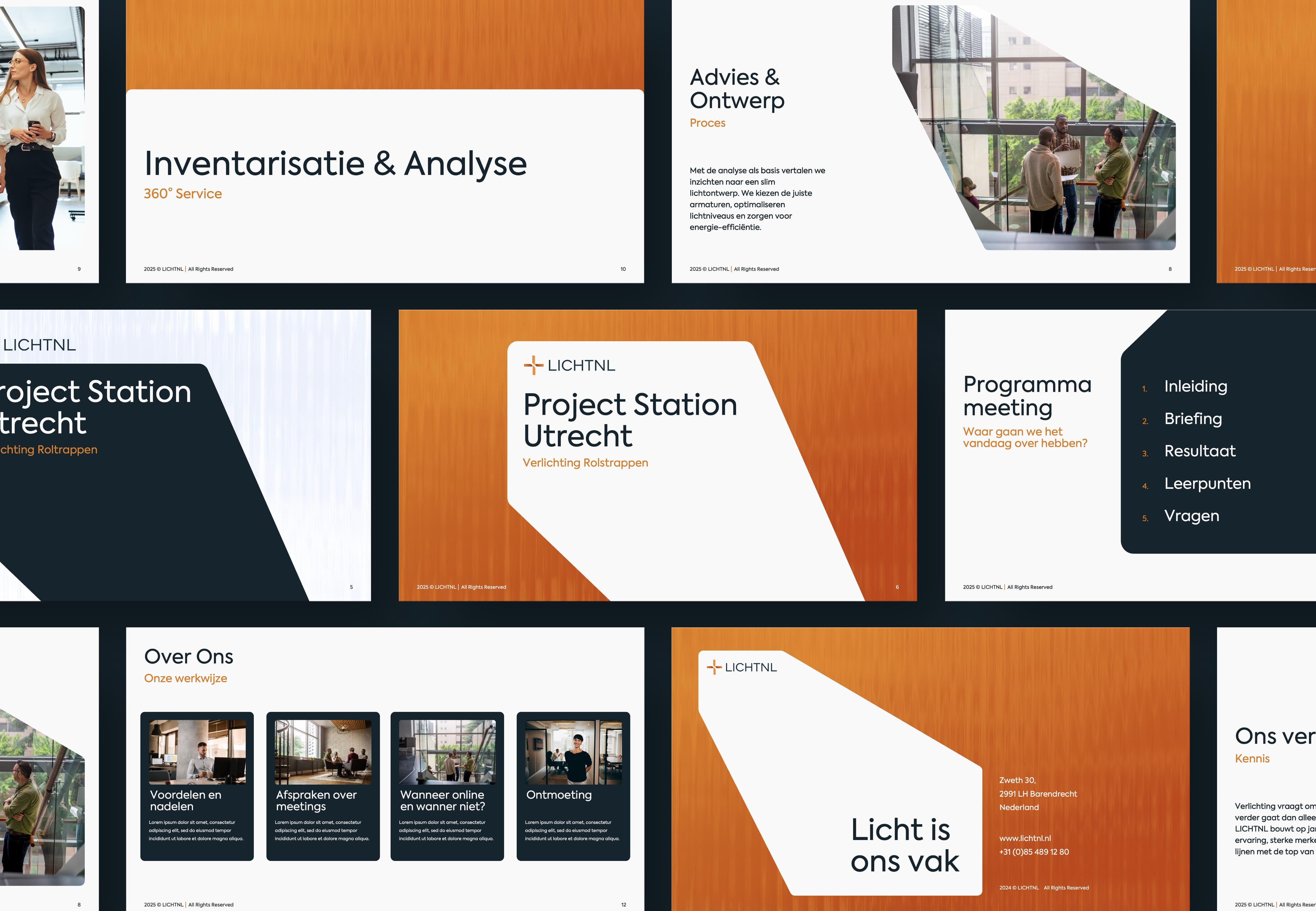
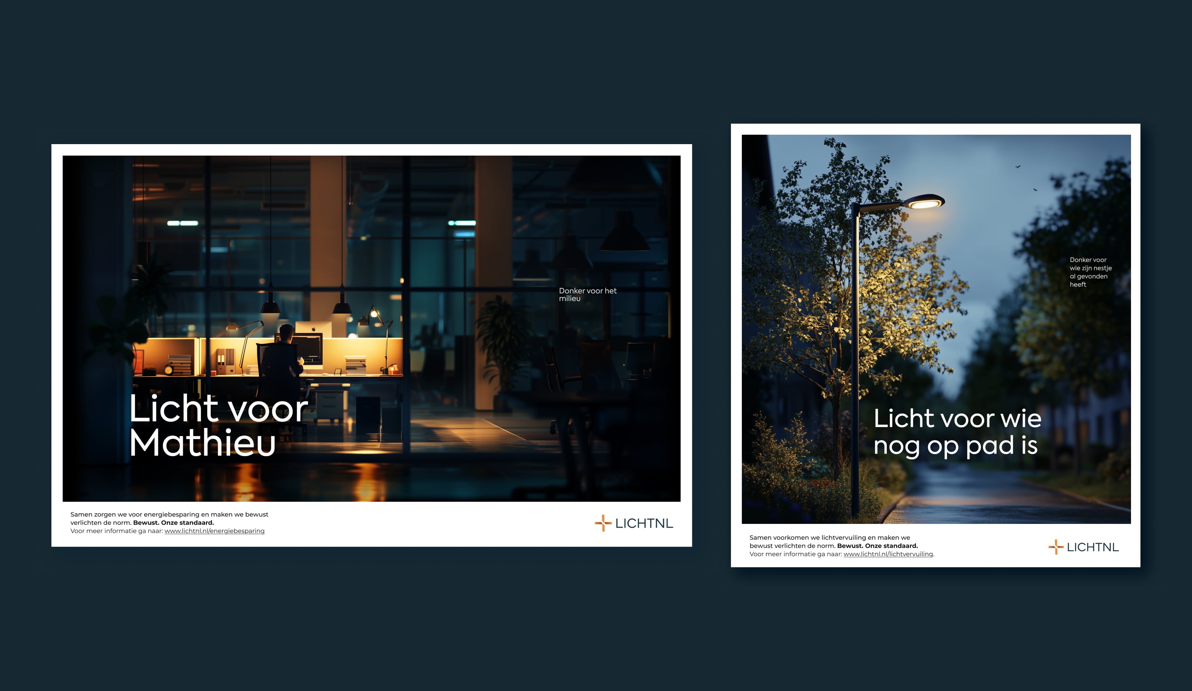
We went back to the source. In an intensive brand strategy workshop, we defined LICHTNL’s shift from supplier to full-service lighting partner and brought their purpose into the light. From there, we sharpened the positioning and values and translated them into a clear, focused brand story. Guided by this new direction, we designed a logo and visual identity that express clarity, confidence and intent. Bold yet precise, modest yet present, the branding positions LICHTNL as a partner that brings structure, insight and foresight to every lighting project.
Default
G2
“Smaac’s creativity, commitment and patience made sure we ended up with something that truly fits us”
Cindy van Hulst
-
Marketing & Communication
LichtNL
1172456058
Default
1181964021, 1172456041, 1172455993
G2
More than just a makeover
More than just a makeover, LICHTNL now speaks a new language. One that reflects both who they are today and who they aim to become. The new brand makes it clear that LICHTNL stands on its own. No longer one of many, but the strategic partner of choice for those who see lighting as an integral part of architecture and experience. The new identity gives LICHTNL the confidence to step into a more strategic role and claim their place earlier in the process. From delivering products to illuminating ideas, ambitions and projects.
Default
Smaac maker
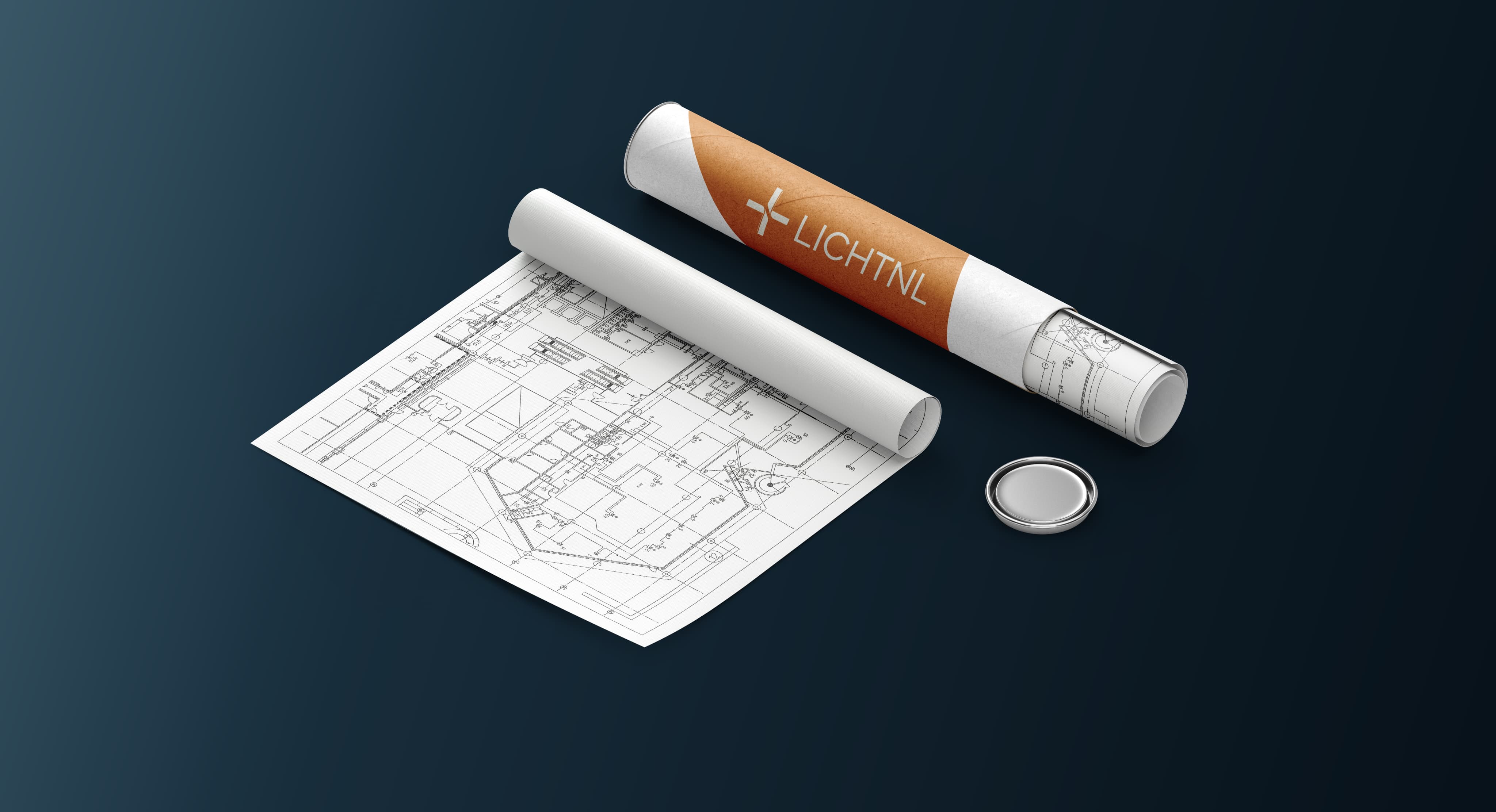
LICHTNL’s ambition is to be involved earlier in the process. And there’s no earlier place than the drawing table. Our logo concept takes this literally, transforming the symbol architects use to mark light points in technical drawings into a clever, instantly recognisable visual anchor. Every time an architect places a light point, they’re, consciously or not, confronted with the LICHTNL logo. While we had to compromise on some executional details—you can’t win everything—it remains a smart, concept-driven mark that embeds the brand directly into its world. Subtle, relevant, and unmistakably LICHTNL.
1186225475
Default
Working with this team was a great experience, and we are very grateful for the collaboration. It was an intense process, with a few moments of blood, sweat and tears, but the final result was more than worth it. We are very happy with what we created together and fully stand behind it. Smaac’s creativity, commitment and patience made sure we ended up with a brand that truly fits us. It really feels like "LICHTNL", and that is exactly what we hoped to achieve.

Cindy van Hulst
Marketing & Communication
-
LichtNL
No items found.
.jpg)