Download
The assets of this page for use in other programs
When you download and use any of this hubs resources, you accept the Terms & Conditions.
Typography
Typography
The two fonts we use for our brand are Neue Regrade (Medium) and Jost (Regular and Light). Neue Regrade Medium is used for titles, Jost Regular for sub titels and Jost Light for body text. To create a clear hierarchy, it is important to use the correct typefaces in the right way.
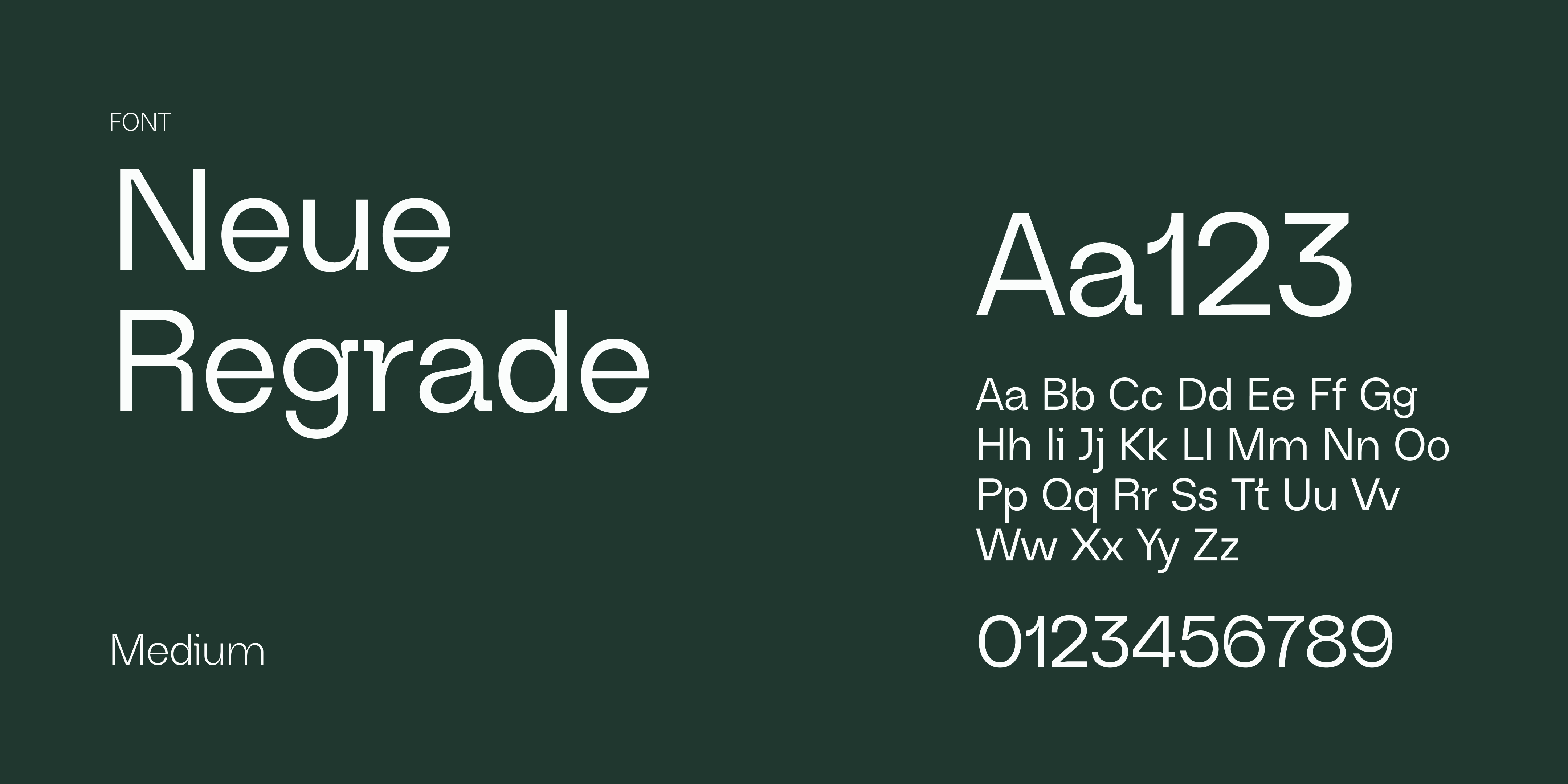
Neue Regrade is a custom sans serif font, which combines the smooth curves of a gohtic typography and the slight inktraps in modern type faces. It has a technical feeling but also has a friendly tone.
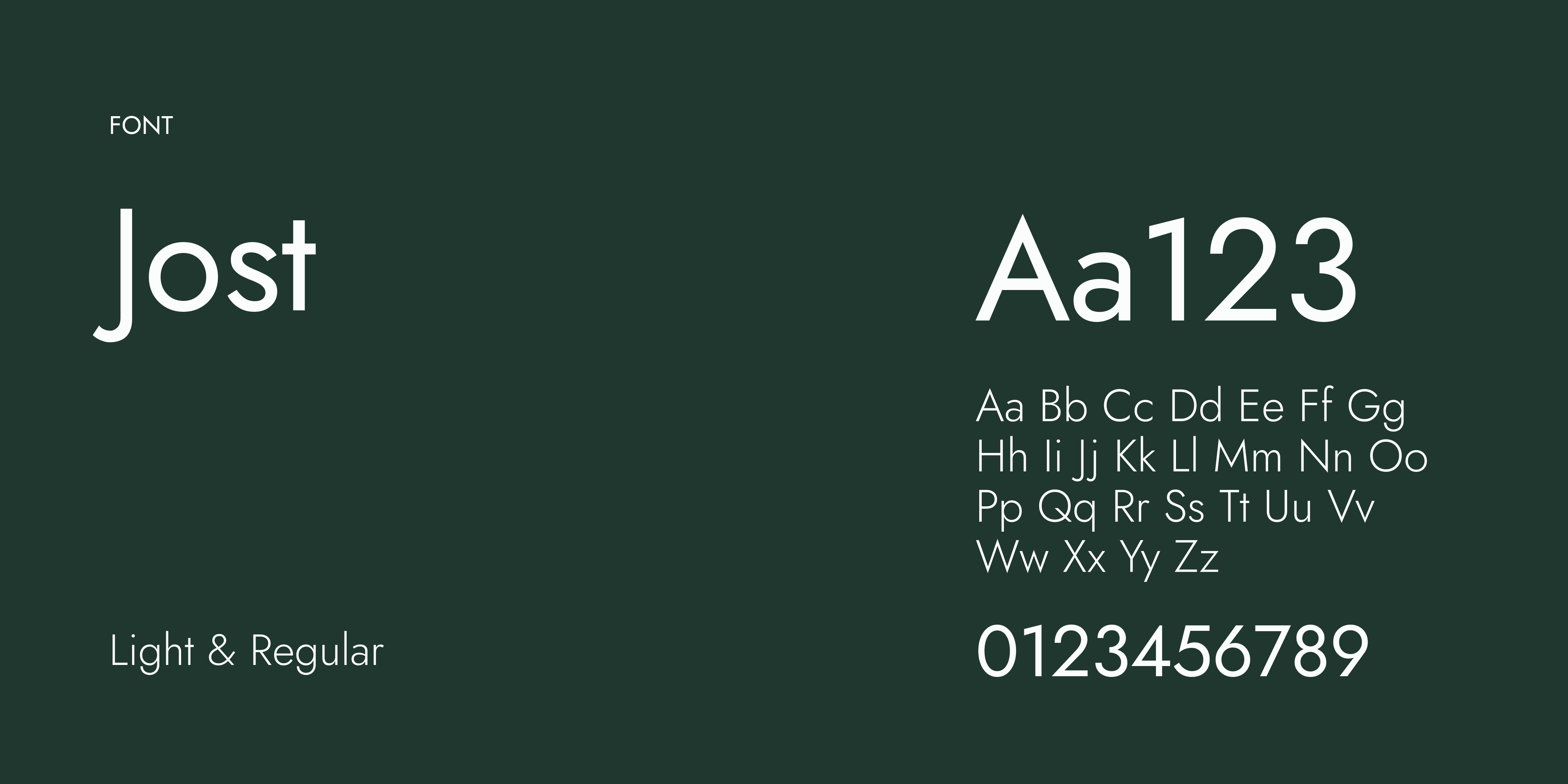
Jost works well as body text because it is open, calm, and easy to read. The shapes feel balanced and steady, which helps longer passages stay clear without pulling attention away from the message.
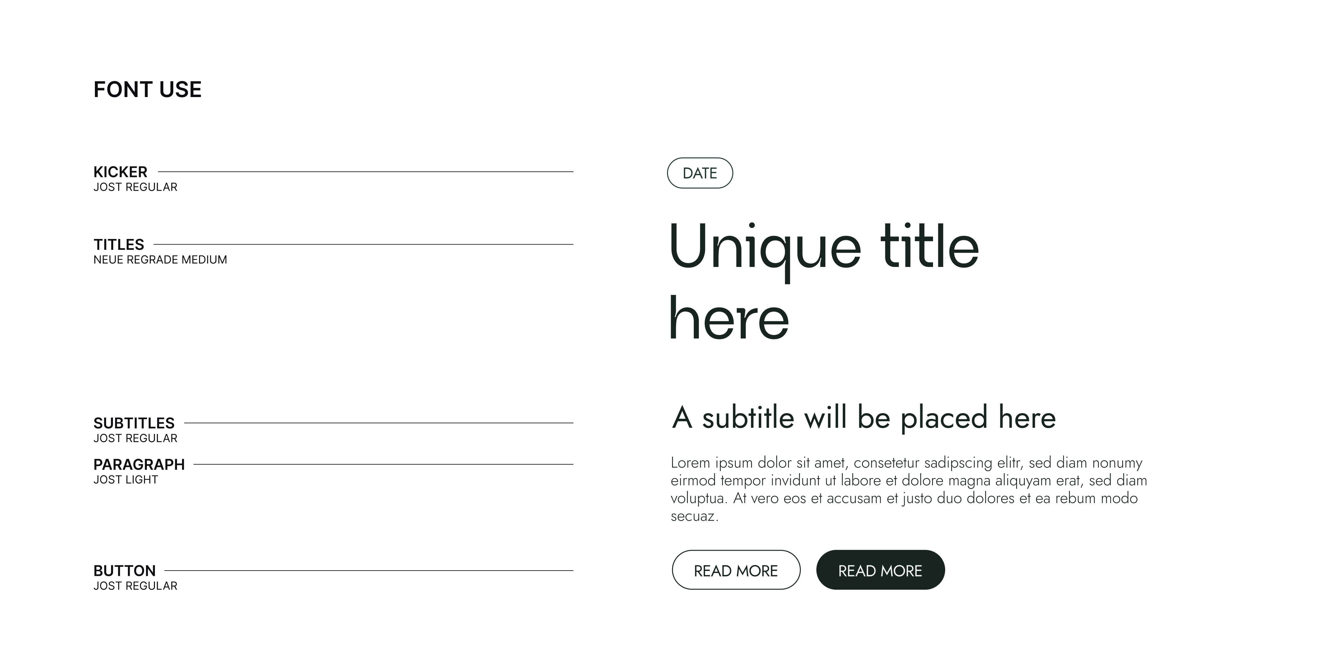
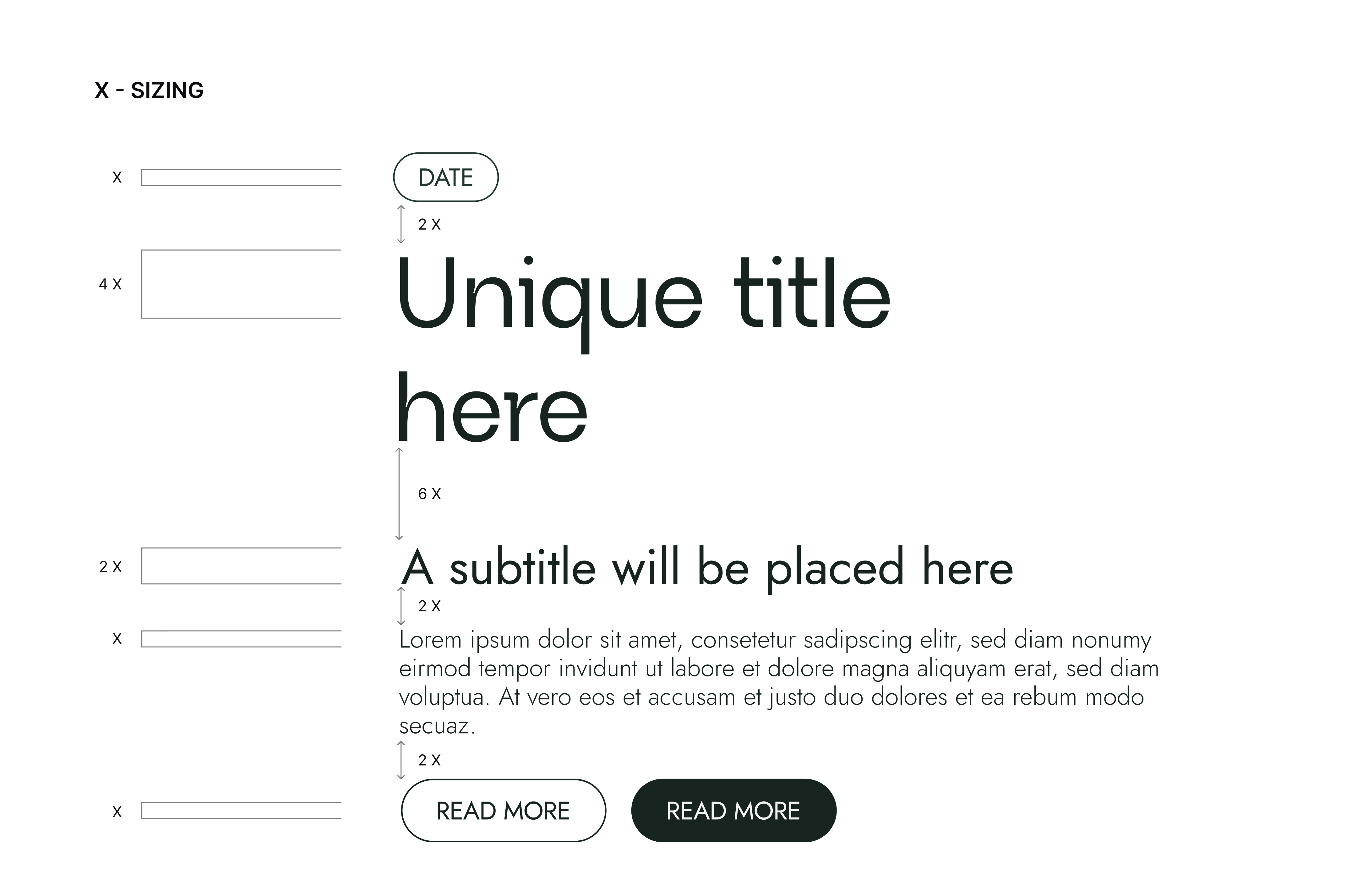
The body text size is x, the other sizes are multiples of this. For example, if the body text is 15 px, then the subtitle is 30 px and the main title is 60 px.
The line height for body text is 115%. For the main titles and sub titels we also use 115% line height.
Just like in print and digital design, we use a base unit x on the web, which corresponds to the size of the body text.
Because websites often have a higher information density and require different, more complex layouts, we have created a separate spacing system for web. This system clearly maintains visual relationships while still providing enough breathing room.
For the standard heading styles (H1–H6), the spacing is as follows:
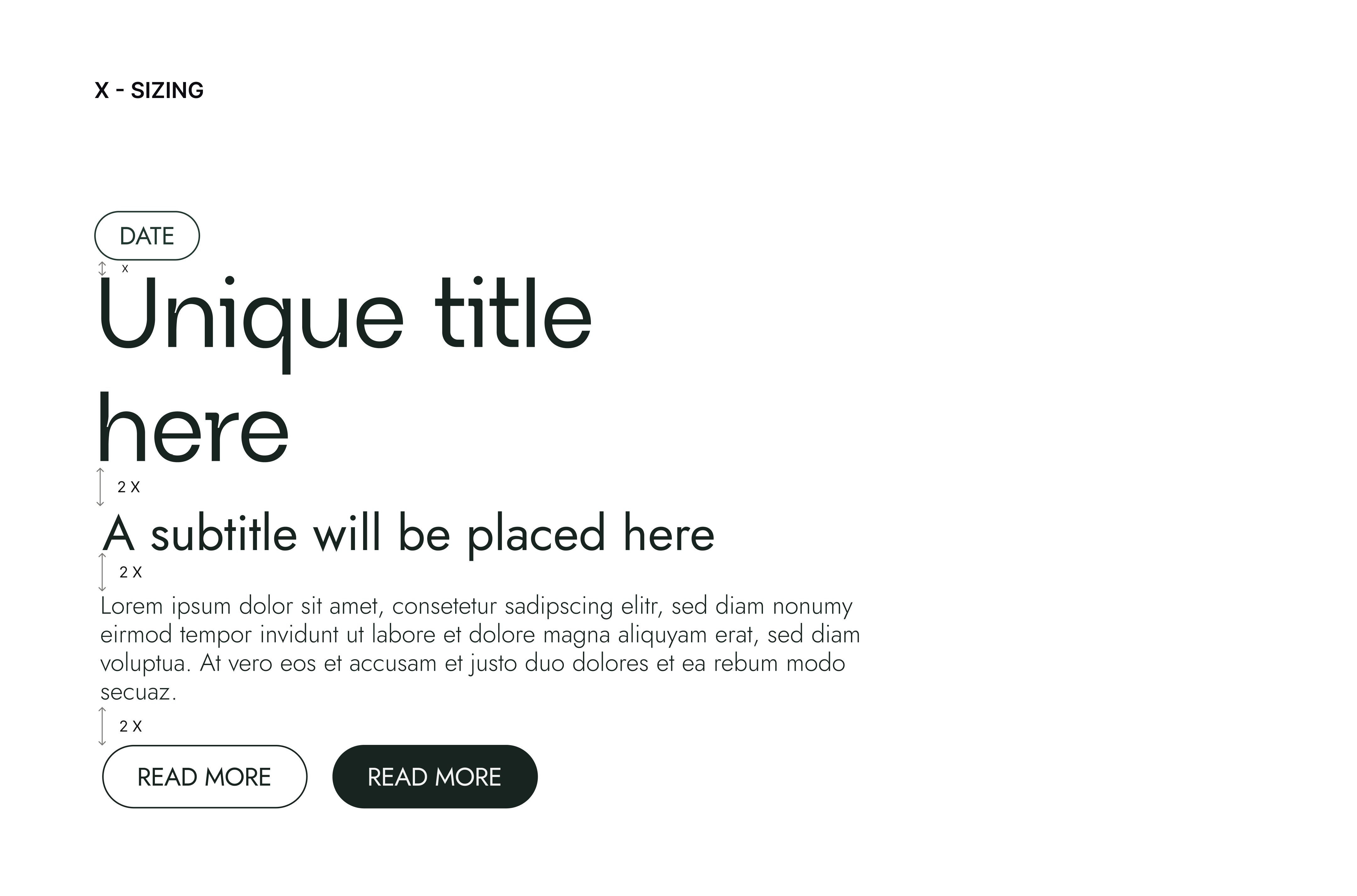
Display headings are large enough that they require some additional space. The following overrides apply:
Variations in the base unit
14px (Regular) is the default body text size. In some cases, however, we want to deviate from this when certain content requires greater emphasis or readability. We therefore use two additional variations: 16px (Medium) and 20px (Large).
When the base unit changes, the spacing of the associated typographic elements changes accordingly, ensuring that the spacing rules remain consistent.
In Figma, we manage this using Variable Modes. When using a text style with a size of 16px or 20px, we apply the corresponding Variable Mode to the container or entire section containing the related text.
On the web, this corresponds to the behavior of the em unit.
On mobile, we use different text sizes, but the spacing does not scale along with them. Mobile spacing therefore always uses the 14px base unit.