Download
The assets of this page for use in other programs
When you download and use any of this hubs resources, you accept the Terms & Conditions.
Colours
Colours
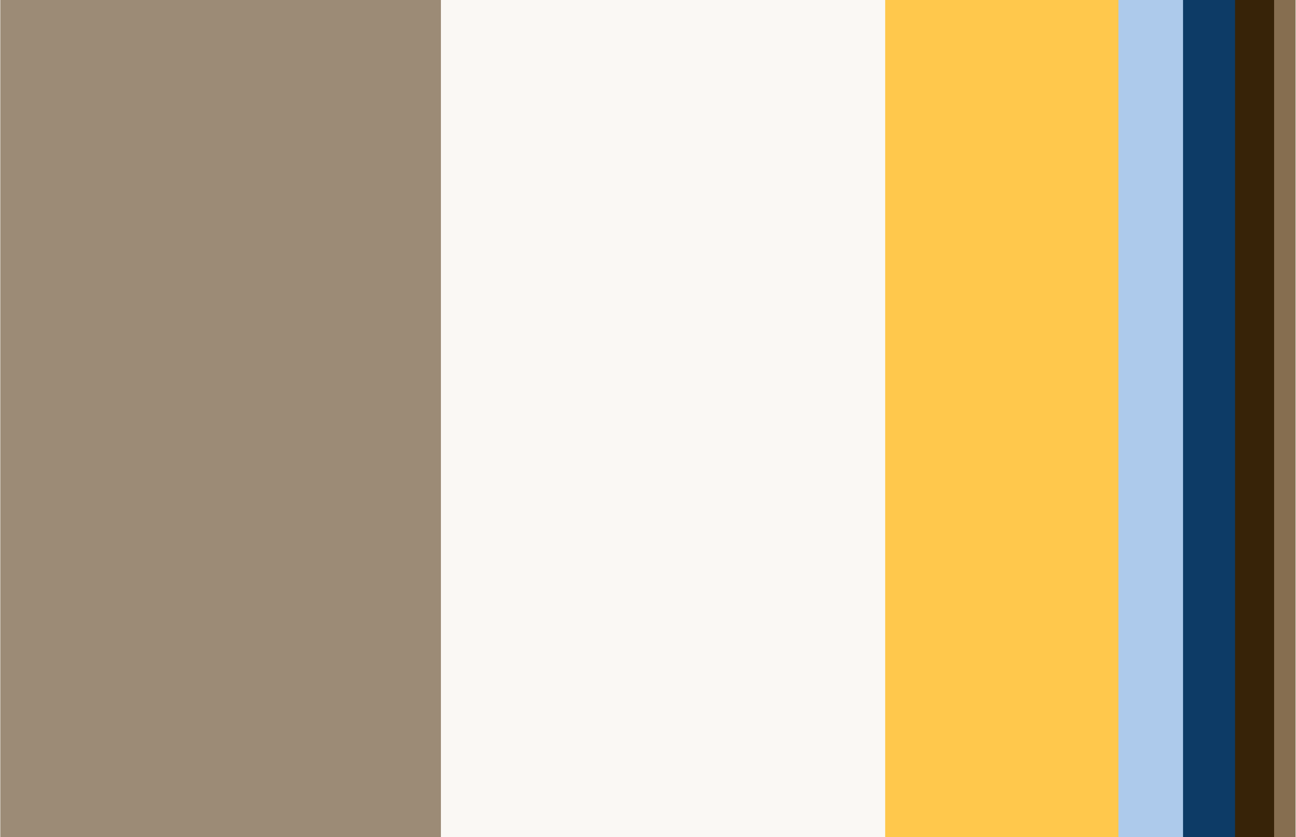
Our brand communications are largely built around the primary colors, ensuring we remain consistent and recognizable.
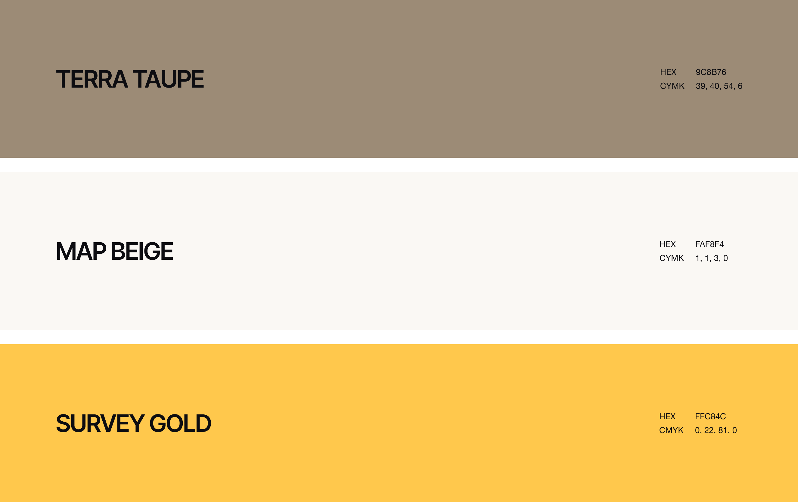
Terra Taupe is a warm, earthy base color that provides a calm and trustworthy background. It is most commonly used as a background block.
Map Beige is a light, soft neutral that works perfectly as a subtle backdrop. Use Map Beige generously—for example, for background panels, text areas, and calm divisions within layouts.
Survey Gold serves as a strong secondary accent color that works well for action-driven elements such as buttons, badges, and CTAs. Use Survey Gold deliberately and in small amounts to clearly highlight interaction points and key information.
Secondary colors are an important complement to the primary colors, especially when a distinction needs to be made between different elements.
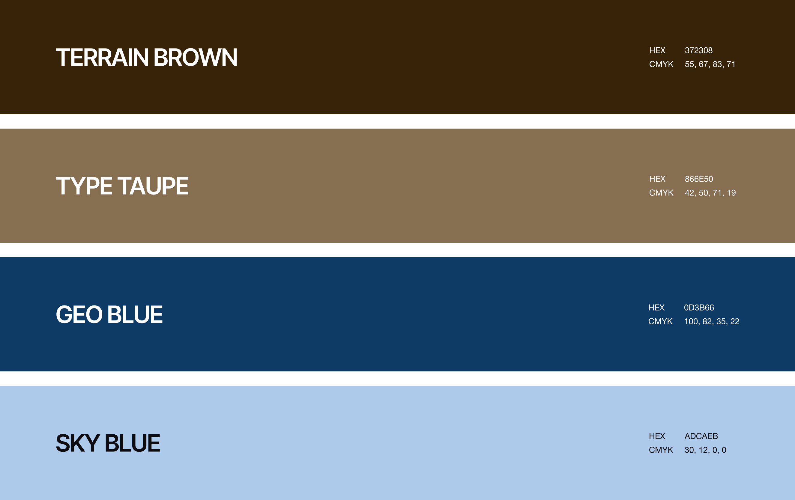
Geo Blue and Terrain Brown are dark, bold colors that are ideal for headings, key texts, icons, and functional navigation elements. They contrast strongly with the lighter background colors, ensuring excellent readability and drawing attention. These colors are applied selectively and purposefully to visually support the content without being overpowering.
Sky Blue is a fresh and bright primary accent color that subtly draws attention. Use this color sparingly for striking highlights and background accents.
Terra Taupe and Map Beige are the dominant colors in our palette.
Sky Blue and Survey Gold are used deliberately and sparingly as accent colors.
Geo Blue and Terrain Brown are applied to emphasize key elements, such as text and important icons.