Download
The assets of this page for use in other programs
When you download and use any of this hubs resources, you accept the Terms & Conditions.
Components
Components
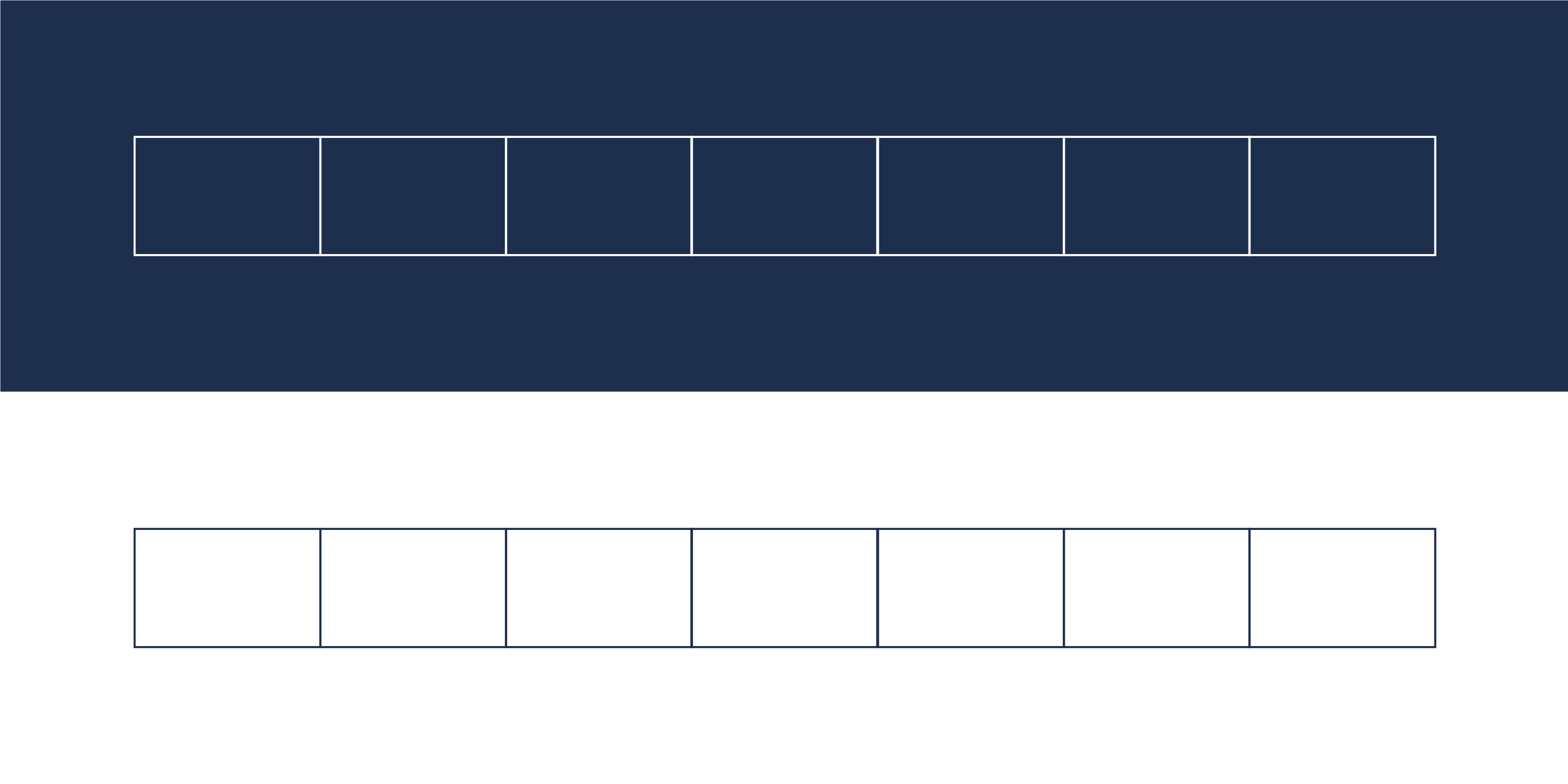
To symbolize the efficient process in the factory, white blocks are used next to each other to accentuate the steps in this streamlined processing. The blocks can be used in different ways in the corporate identity, on a colored background or over a photo. The dimensions of the blocks vary depending on the application.
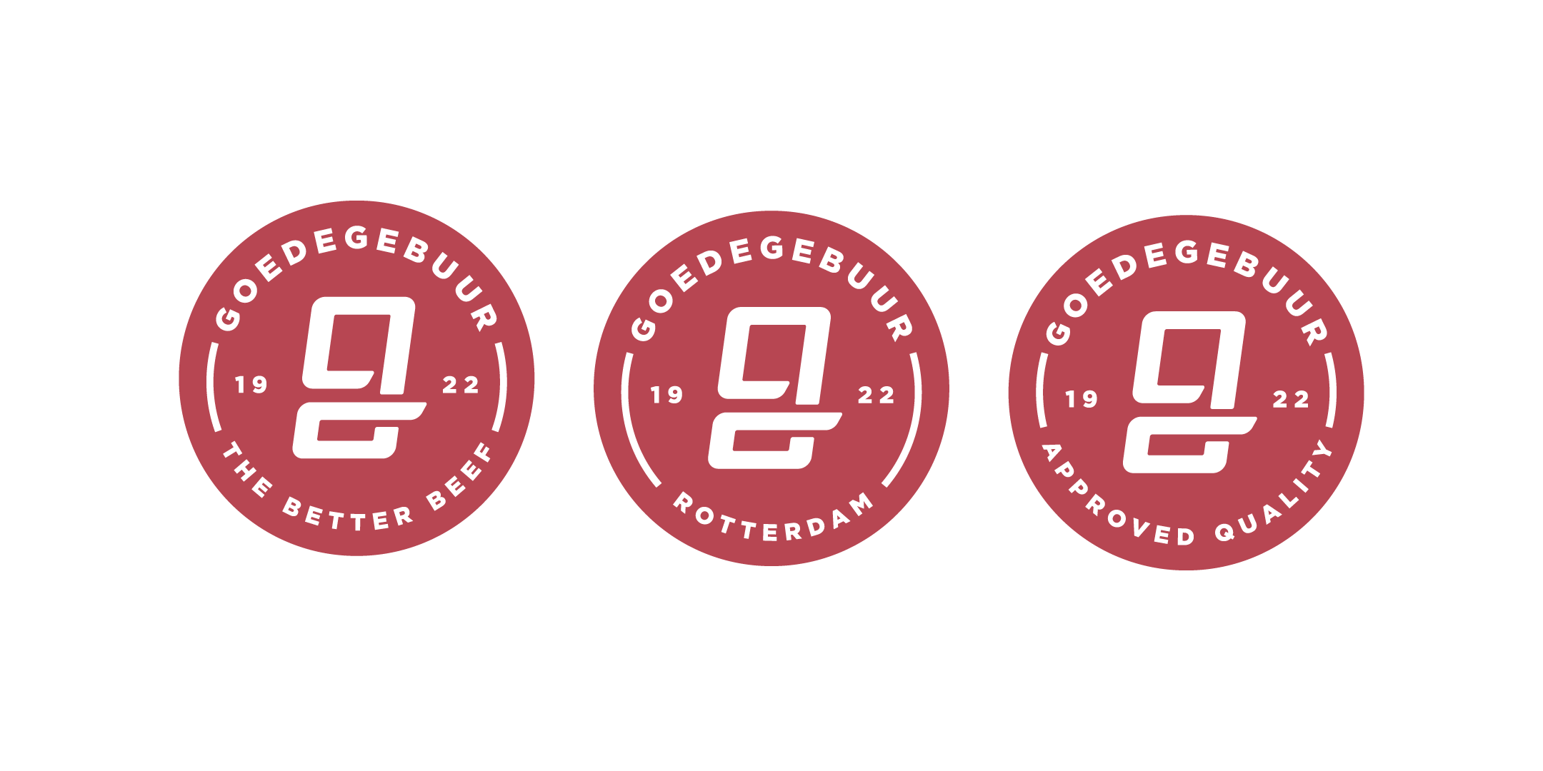
This option can be used when there is less space within the communication medium for the original logo or because it is not necessary to use the complete logo, for example repeatedly. This logo will always be applied at a fixed position at the top right of the communication medium.

This icon can be applied as a seal or as a label. A seal or label provides an authentic look with a modern twist and therefore fits nicely in the authentic and Ruler look we are looking for. In addition, it provides flexibility within the various designs in the future.
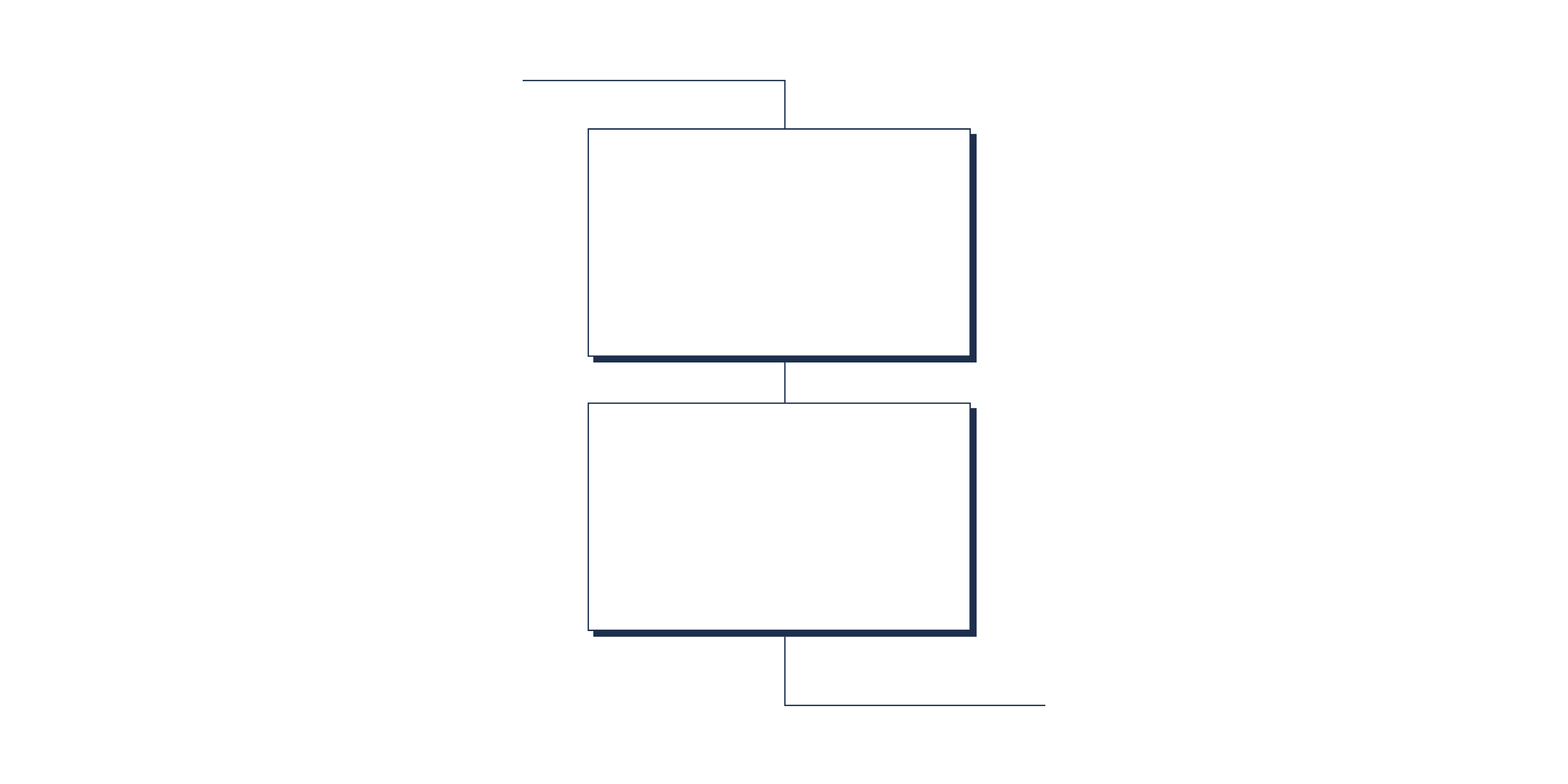
For various outlined elements within the means of communication, we opted for a blue outline and a hard drop shadow on the bottom right of the outlined element.
This outline and shadow provide a clear but also very recognisable demarcation of the distinguishable elements, as well as a visual link to the processing grid.
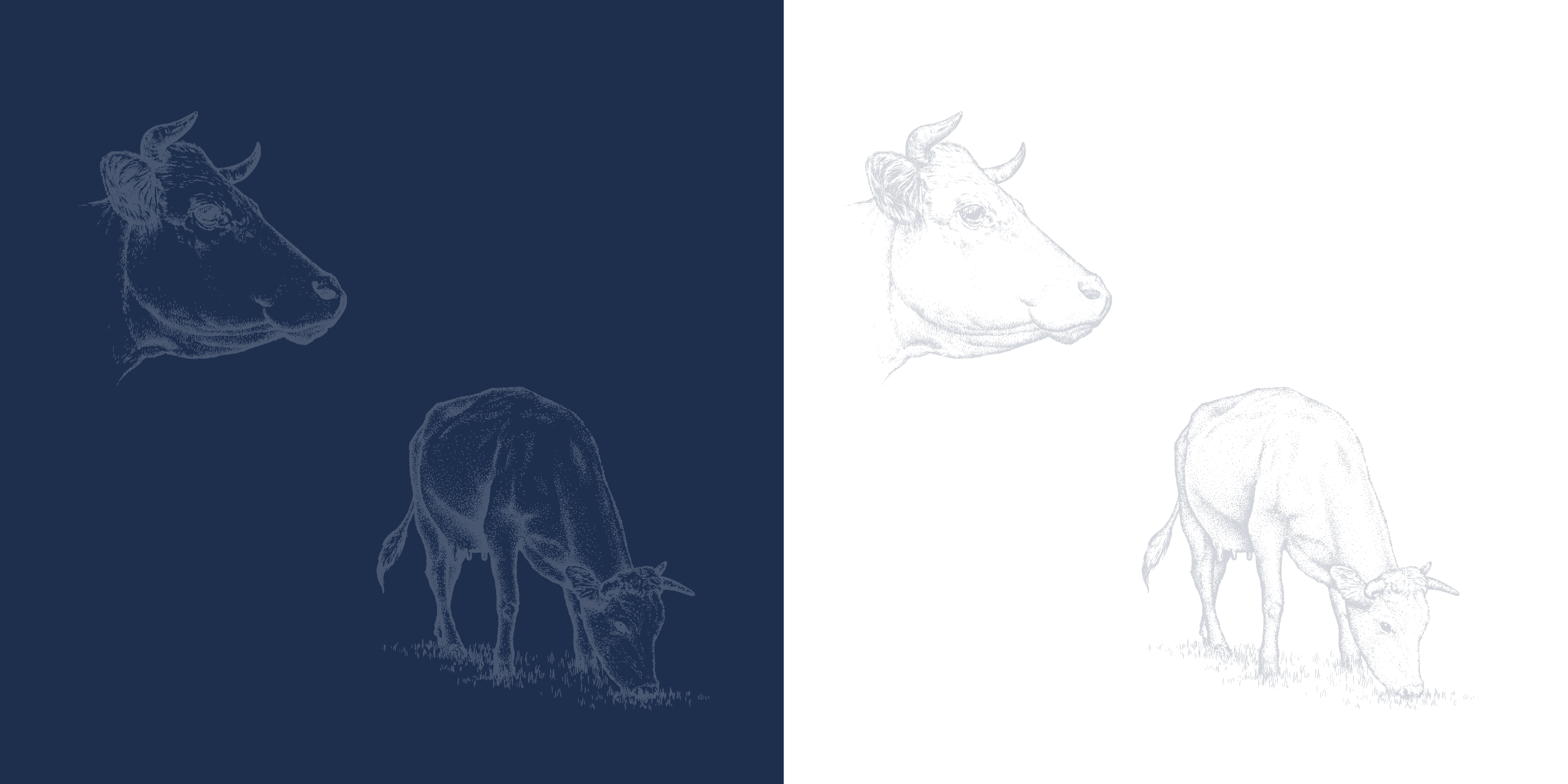
The drawn cow in a Ton sur Ton (color on color) appearance is mainly used in backgrounds to bring back a bit of feeling and authenticity in the brand identity. In addition, it is of course a clear link to the old logo.
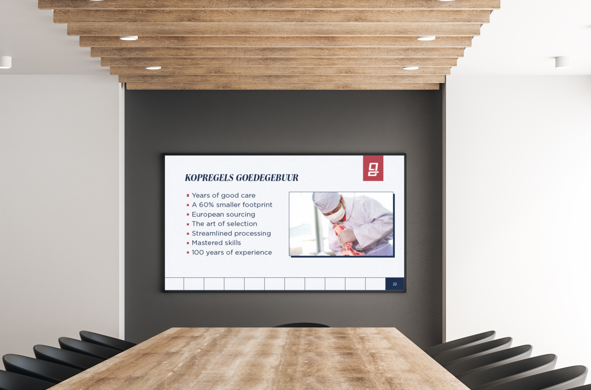
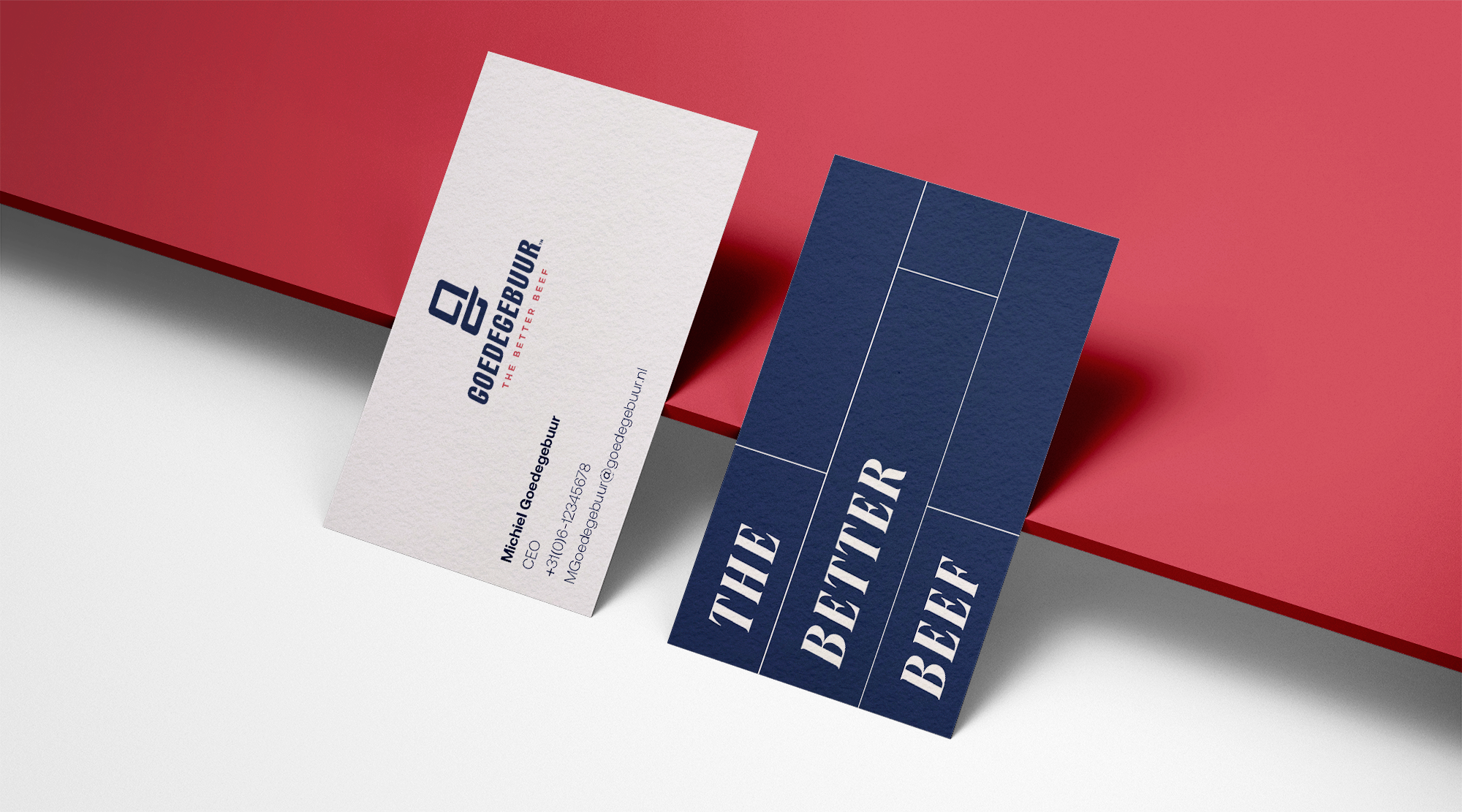
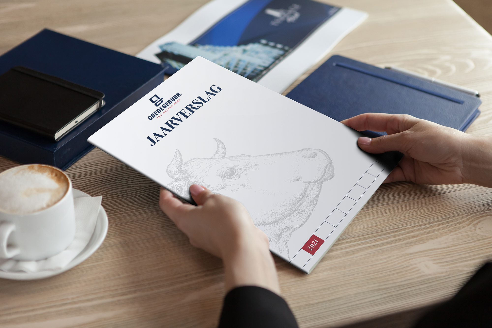
Some examples of how the different brand components work together and can be applied in a graphic design.
.png)
.png)