Download
The assets of this page for use in other programs
When you download and use any of this hubs resources, you accept the Terms & Conditions.
Typography
Typography
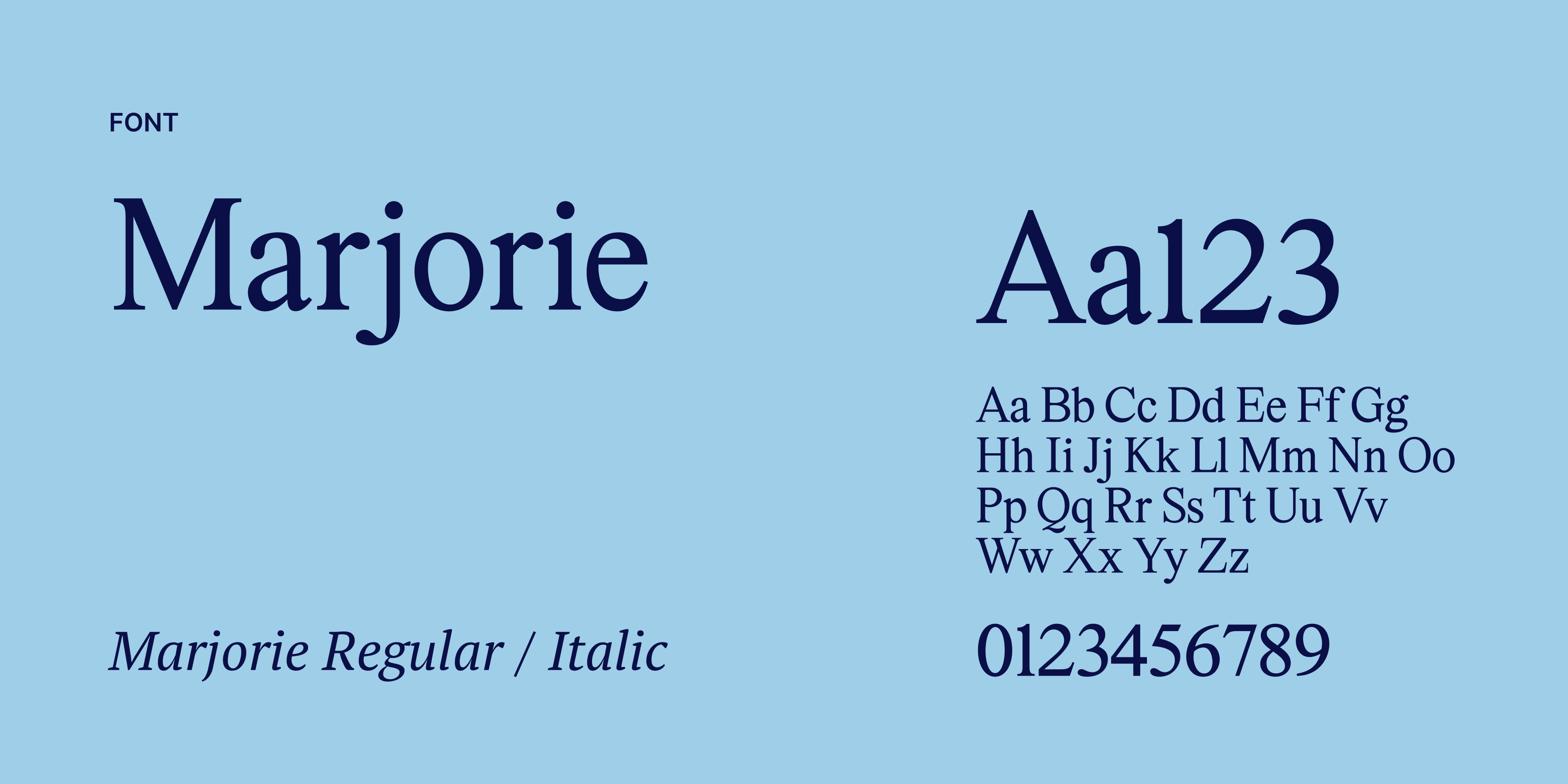
Marjorie is a modern and refined serif typeface. Its balanced shapes and subtle details give it a confident and distinctive tone. The typeface adds character to the visual identity while keeping the overall look clear and professional.Marjorie is used exclusively for headings. Within titles, the Regular and Italic styles can be combined to create emphasis and contrast. This adds a subtle dynamic without overwhelming the layout.
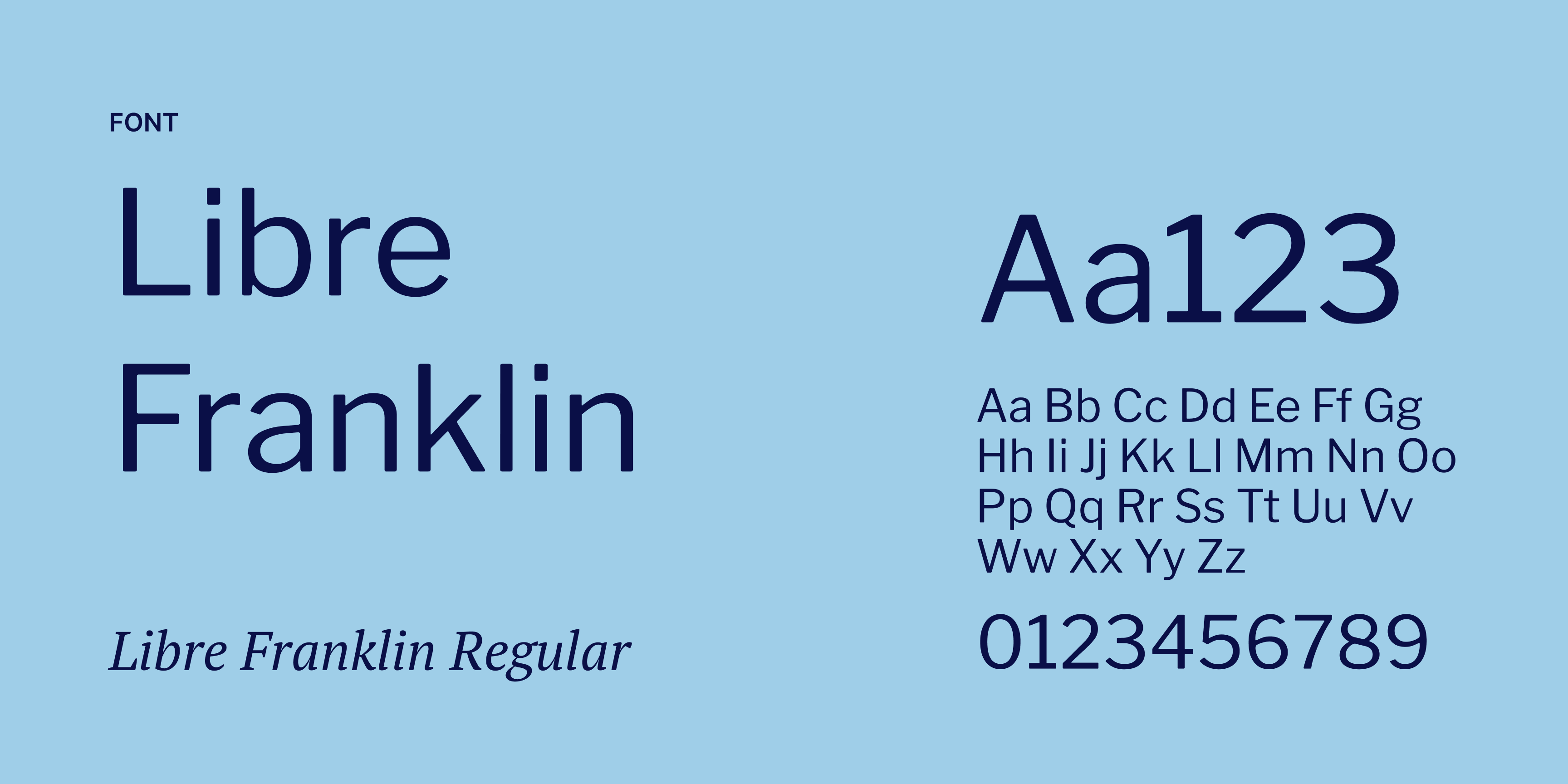
Franklin Libre is the typeface used for all body text. It is a clean and highly readable sans serif font with a clear and balanced structure. Its straightforward design ensures that longer texts remain easy to read, both on screen and in print.Only Franklin Libre Regular is used. By keeping to a single weight, the typography stays consistent and calm, allowing the content to take the lead while maintaining a professional and reliable appearance.
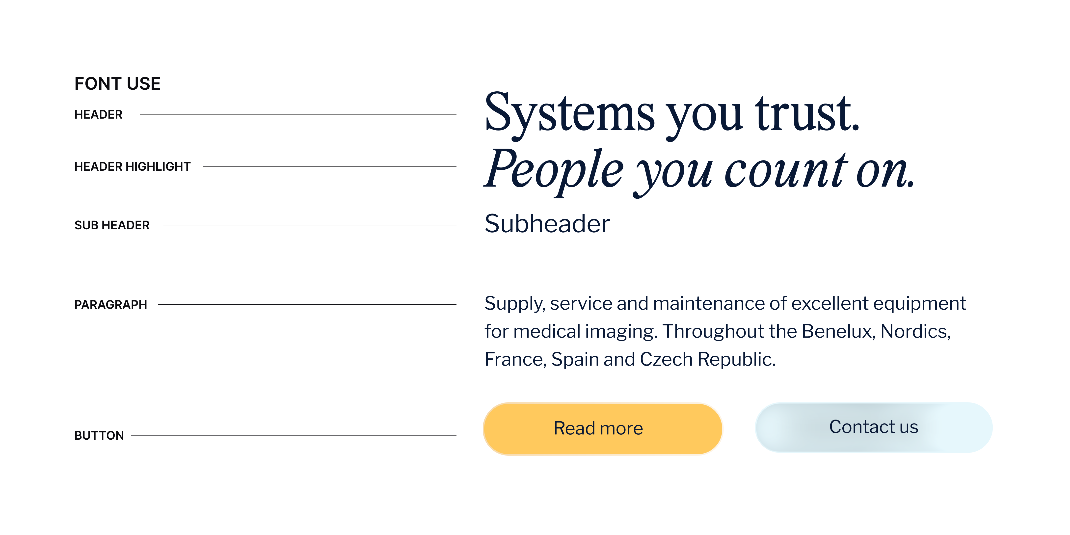
Headings are set in Marjorie, combined with the Italic style of Marjorie to highlight specific words within the title. Subheadings are written in Franklin Libre, the same typeface used for body text.There are two button styles: a yellow button and an optional glass effect button.
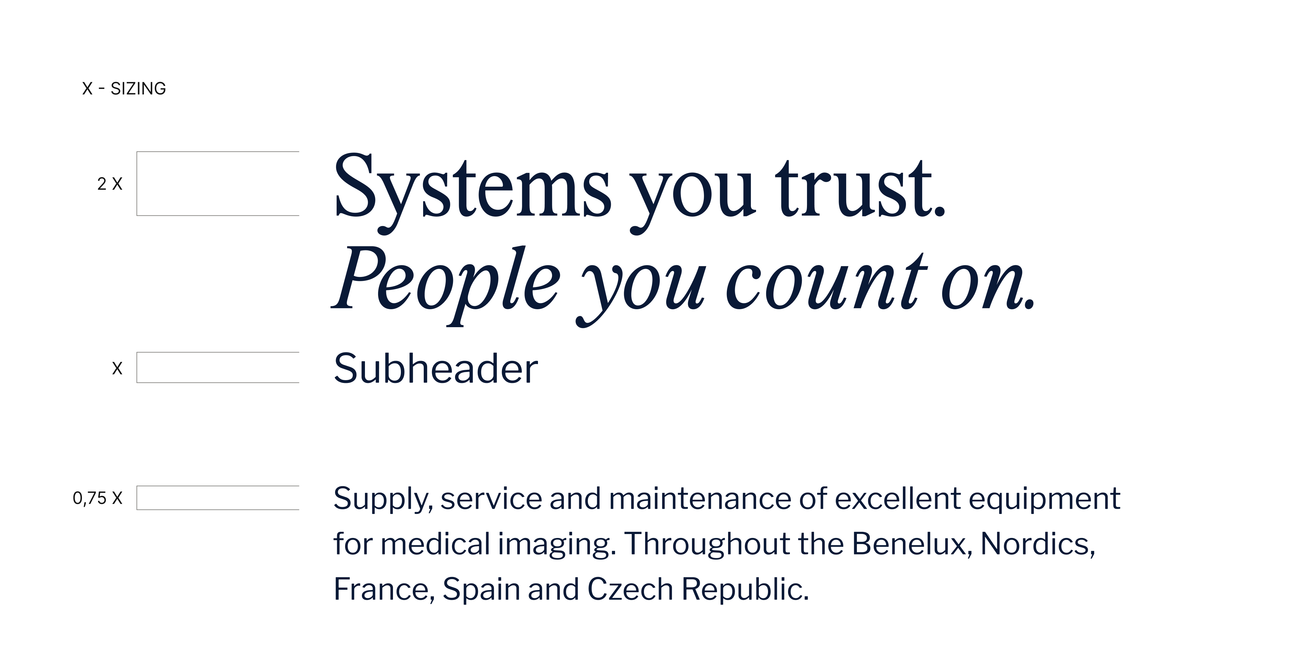
The typefaces follow a fixed scale to maintain clear readability and a consistent hierarchy.