Colors

Colours are a direct and vital way for a brand to communicate tone and evoke emotion. Because of our deep psychological and evolutionary associations, humans are emotionally deeply affected by colours. By using colours effectively, your brand can instantly convey the right message.
Brand component

Colors

Colours are a direct and vital way for a brand to communicate tone and evoke emotion. Because of our deep psychological and evolutionary associations, humans are emotionally deeply affected by colours. By using colours effectively, your brand can instantly convey the right message.

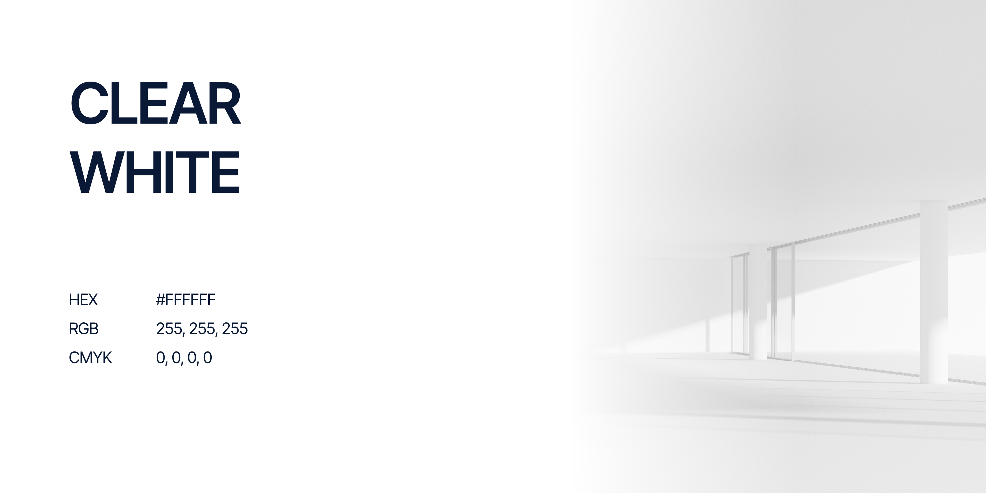
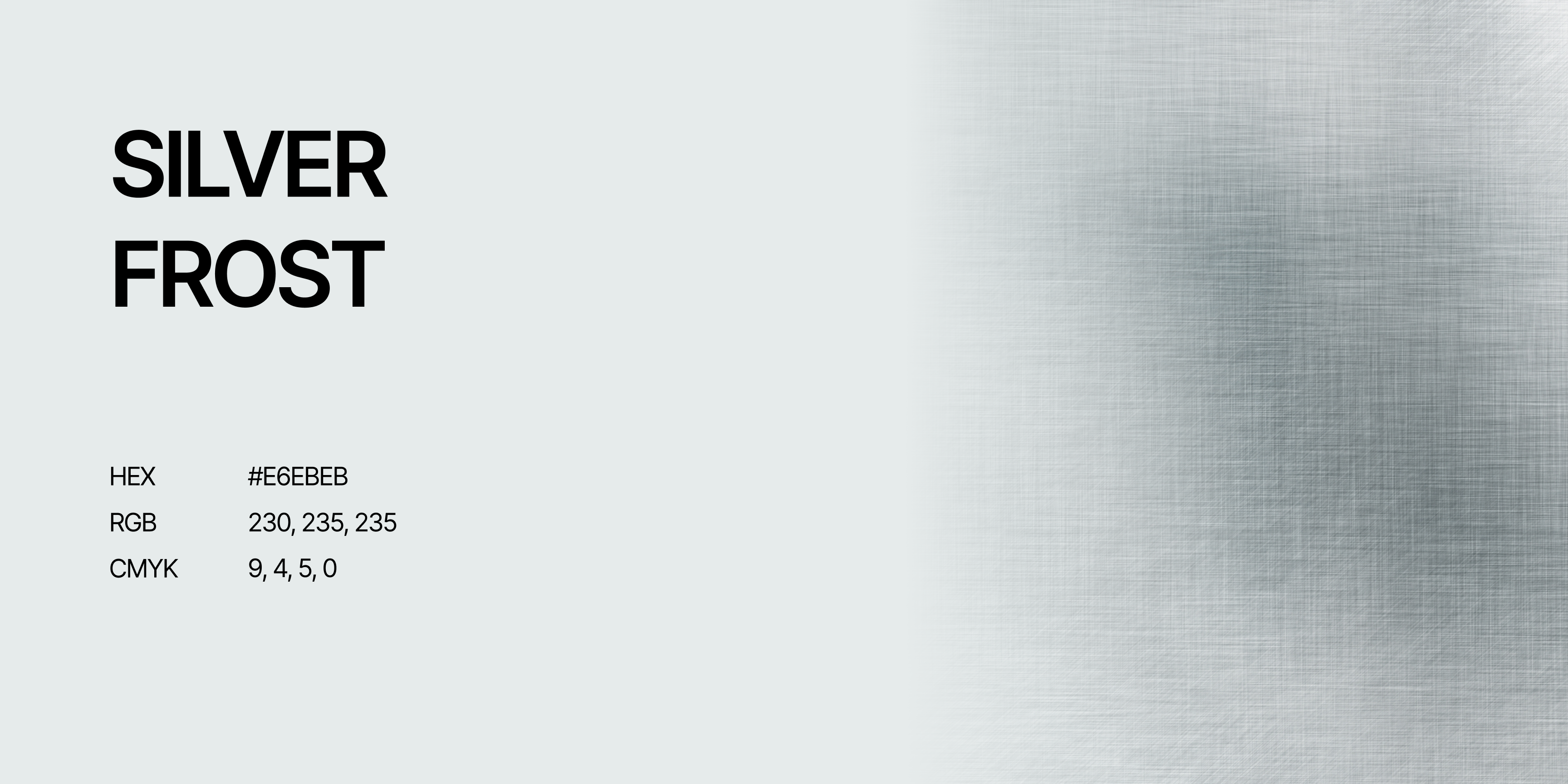
Clear White and Sky Blue form the foundation of the visual identity. These colors create calm and clarity and keep layouts clean and easy to read. They leave room for other tones and support a reliable, medical appearance.

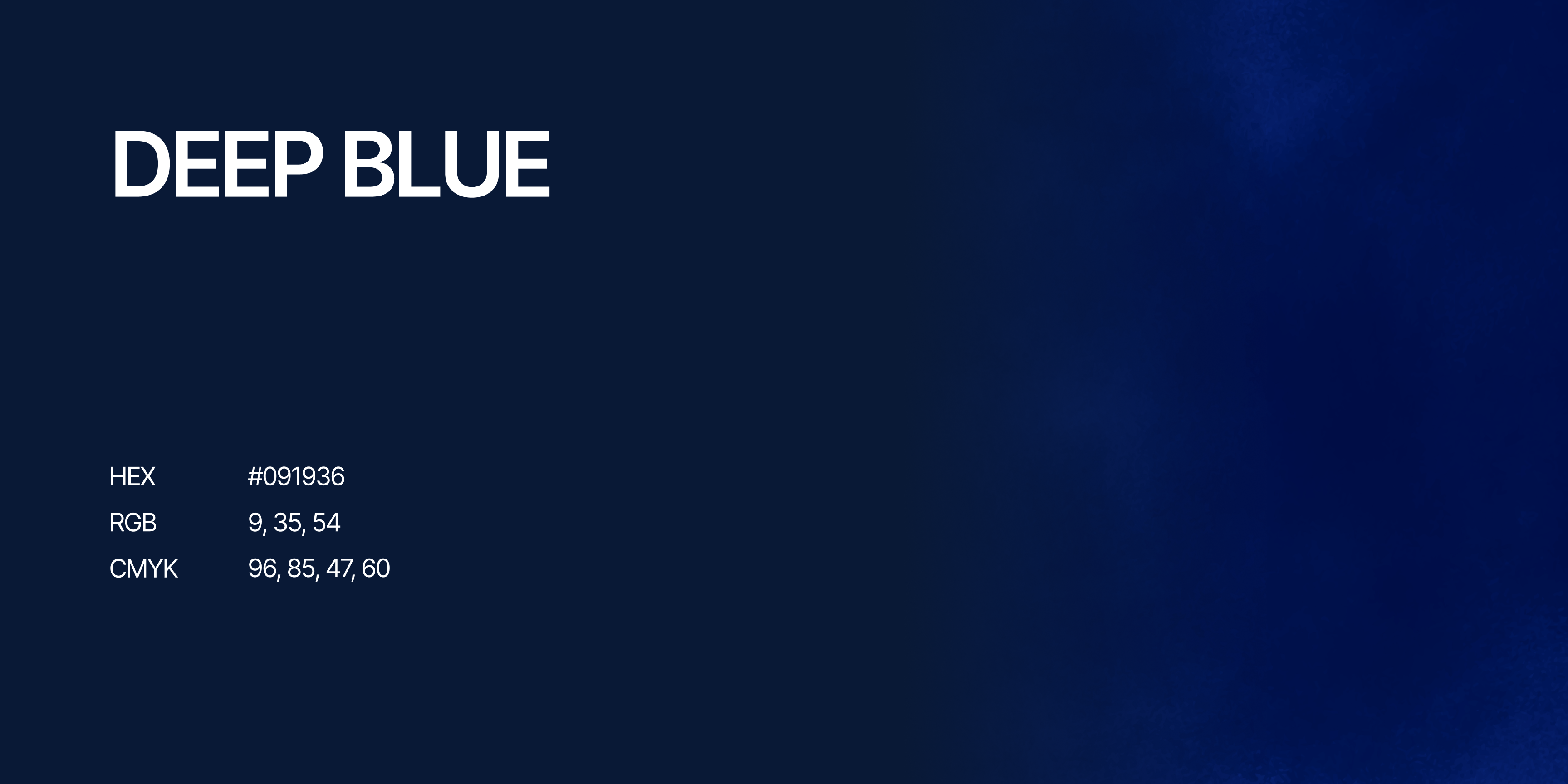
Deep Blue adds contrast and depth to the color palette. This color creates focus and stability and gives the visual identity a strong and professional character that fits Tromp Medical.

Warm Gold is the accent color within the visual identity. This tone is used sparingly and draws attention where needed. It adds a warm detail and makes the visual identity recognizable without disturbing the calm.


‍

COLOR USAGE

Close-up of layered cards showing services labeled CGI, Social Media, Websites, Visualizations, and Logo Development.

Download

The assets of this page for use in other programs
When you download and use any of this hubs resources, you accept the Terms & Conditions.
Colors
↗
Colors
↓

Brand Components

All the elements that make up your brand's visual identity

Tromp Medical

Logo

Typography

Components

Templates

Created by
Smaac logo
Created by
Smaac logo
Click to copy