typography

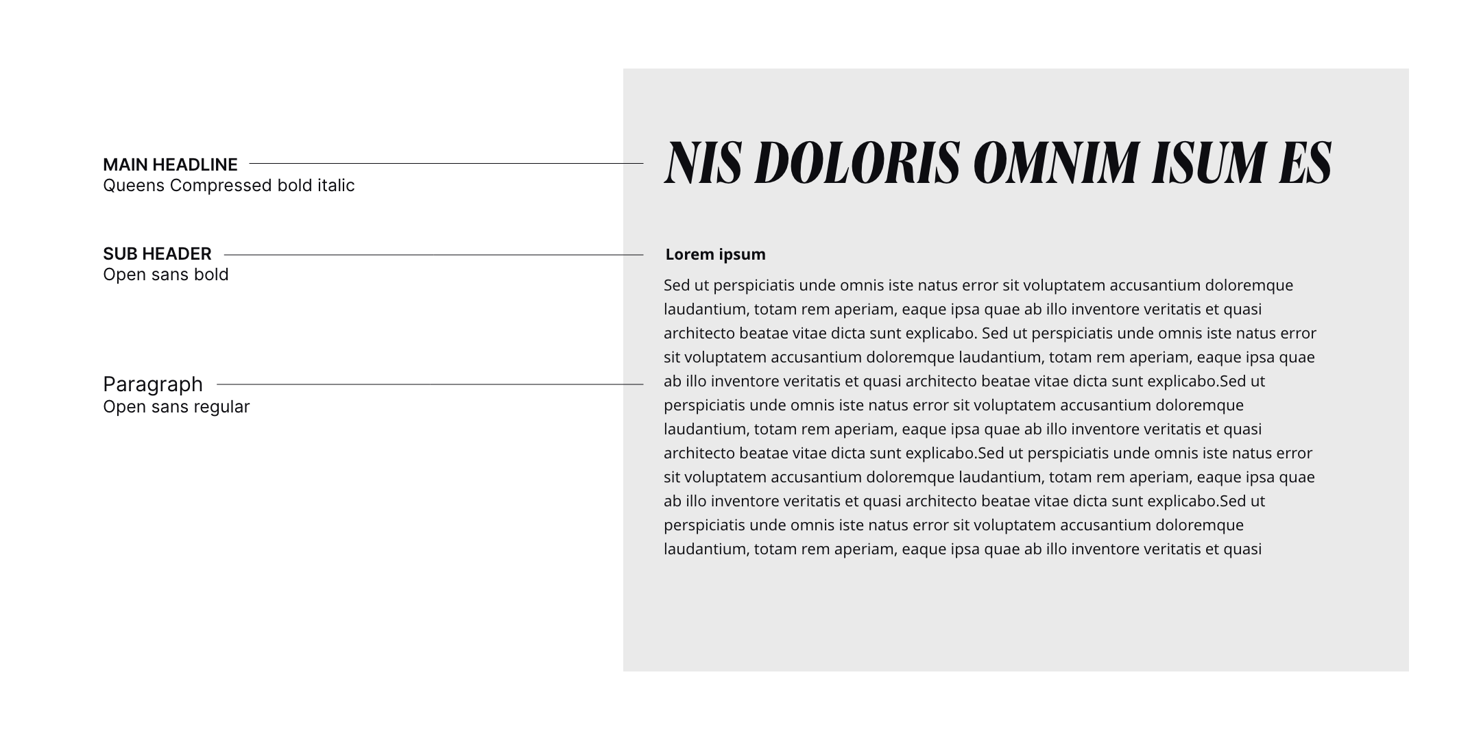
Typography is an important part of the corporate identity. All elements should be formatted in the same style, same font, line spacing and font size. The titles are always large, which draws the reader's attention. Where the subtitles look a bit more subtle and more informative, but always have a color compared to the titles and paragraph text. The following examples illustrate how typography should be used in the corporate identity.
Brand component

typography

Typography is an important part of the corporate identity. All elements should be formatted in the same style, same font, line spacing and font size. The titles are always large, which draws the reader's attention. Where the subtitles look a bit more subtle and more informative, but always have a color compared to the titles and paragraph text. The following examples illustrate how typography should be used in the corporate identity.

Typography

‍
A striking font has been chosen for the title that immediately grabs the reader's attention. Classic serif letters provide a Ruler look but with a modern twist. The subtitles and paragraph text are written in a legible and calm font for both the web and print. The font has a calm appearance, which is a nice contrast to the more prominent titles. But it also creates a more Everyman look.
‍

‍

Close-up of layered cards showing services labeled CGI, Social Media, Websites, Visualizations, and Logo Development.

Download

The assets of this page for use in other programs
When you download and use any of this hubs resources, you accept the Terms & Conditions.
typography
↗
typography
↓

Brand Components

All the elements that make up your brand's visual identity

Goedegebuur

logo

Colors

Components

Created by
Smaac logo
Created by
Smaac logo
Click to copy