Download
The assets of this page for use in other programs
When you download and use any of this hubs resources, you accept the Terms & Conditions.
Colors
Colors
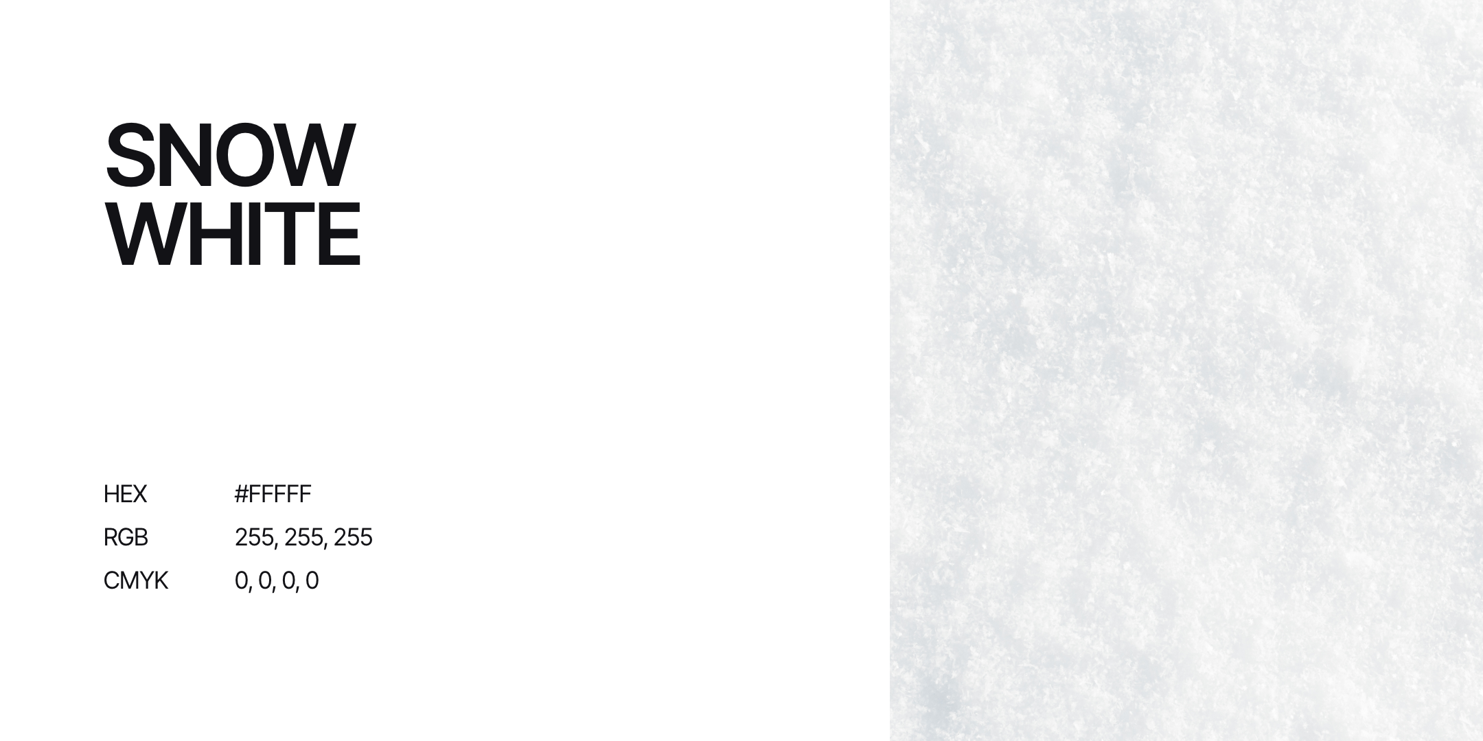
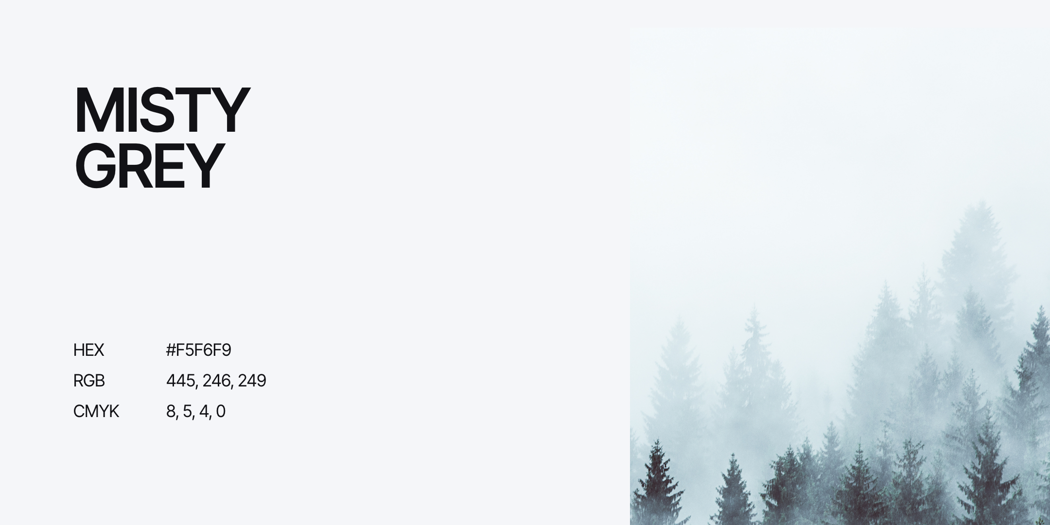
The color palette is divided into primary and secondary colours.
The primary colors are mainly used for large color areas and backgrounds, these determine a large part of the brand identity.
Where the secondary colors are used more as an accent or signal color. Think of buttons, icons, subtitles, links, etc.