Download
The assets of this page for use in other programs
When you download and use any of this hubs resources, you accept the Terms & Conditions.
Components
Components

As a background element there is a pattern of contour lines. This can be used, for example, as a background for presentations and packaging. Be careful not to overlay the pattern with too much text.
This pattern is usually used in combination with a gradient to make it blend towards the background.
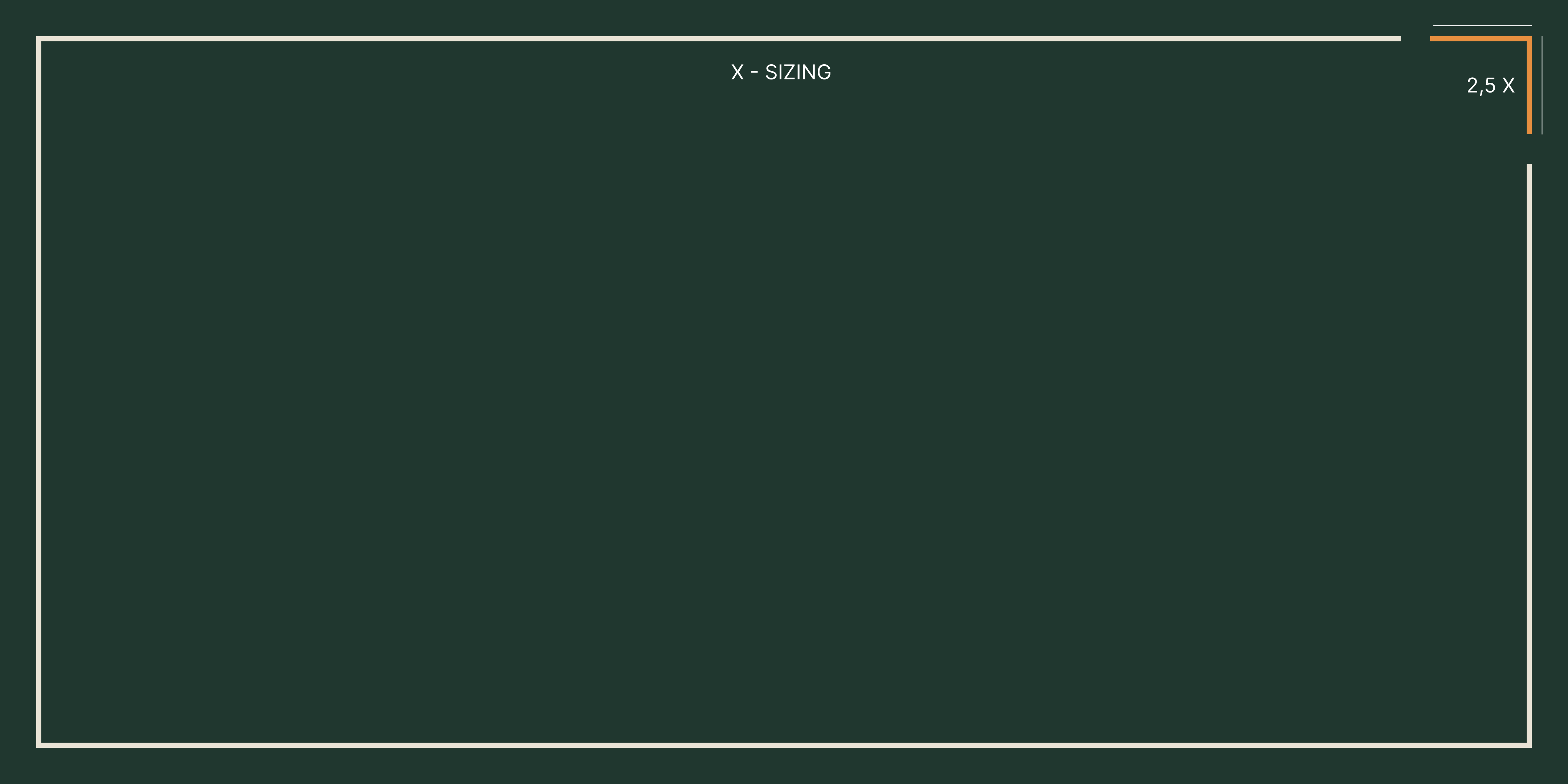
For flyers and packaging, there's a border with one corner in Maize Gold or Seedling Green. This corner can be placed in various locations. However, please note that only one corner can be colored. By Triferto can be placed in the corner. The bottom colored stripe will then be slightly larger than the text.
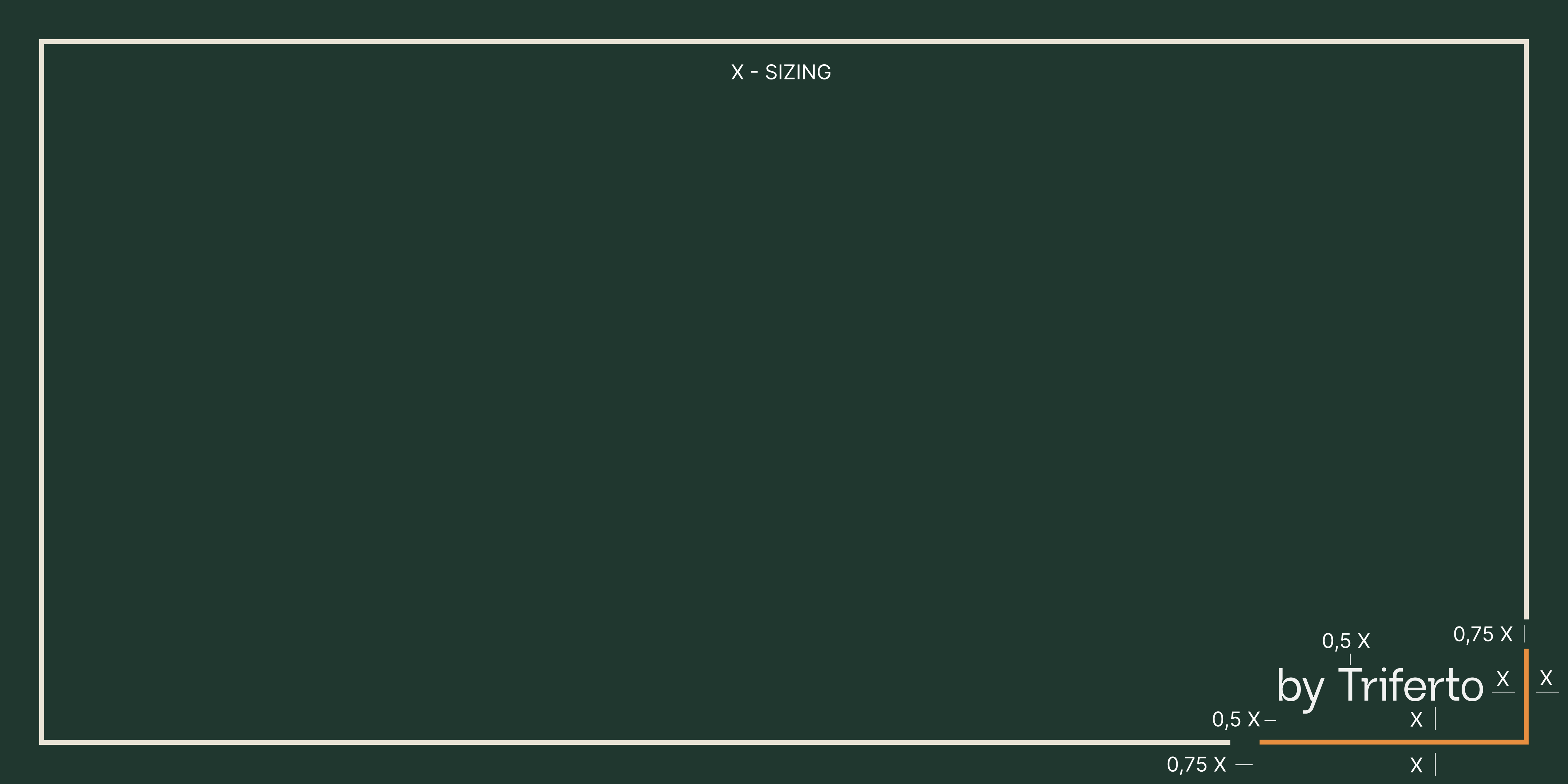
1. What is X?
X is the base unit that defines all proportions.
Always use the shortest side of the format.
Formula
X = shortest side ÷ 20
Example
- Format: 300 × 200 mm
- Shortest side = 200
- X = 200 ÷ 20 = 10 mm
2. Position of the line
Place the white frame line at a distance of 1X from every outer edge.
So:
- Top margin = 1X
- Bottom margin = 1X
- Left margin = 1X
- Right margin = 1X
This keeps the frame visually consistent across all sizes, from small to large.
3. Line thickness
The line thickness scales with the format but always stays within safe print values.
Formula
Line thickness = X ÷ 8
Limits
- Never thinner than 0.3 mm or 1 px
- Never thicker than 2 mm or 13.5 px
This makes sure the line stays visible on small work and does not look too heavy on large work.
4. What if there is text or a logo?
These rules always apply, whether text such as by Triferto is present or not.
The frame line is its own element and is never changed based on content inside or outside the frame.
When there is no text or logo, the size of the corner is 2.5X.
5. Summary for quick use
- Find the shortest side of the format
- Divide that value by 20 → this is X
- Place the frame line 1X inside the edge
- Set the line thickness to X/8
- Use a minimum of 0.3 mm and a maximum of 2 mm

The circles can be used as an overlay over photos or as a background element.
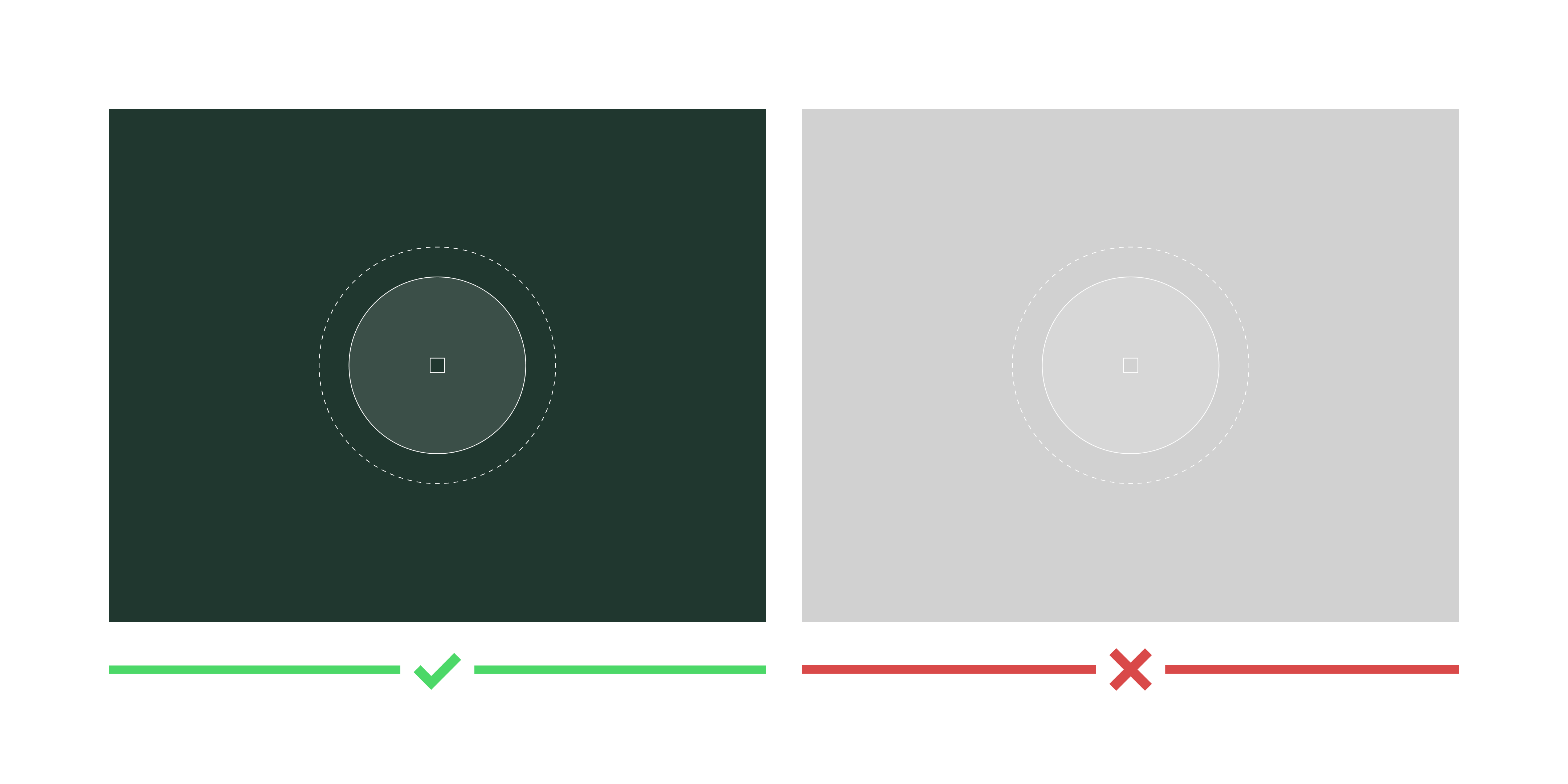
The circles can only be used in white with a dark background.

When placing the circles over a photo, they should not be placed over faces.
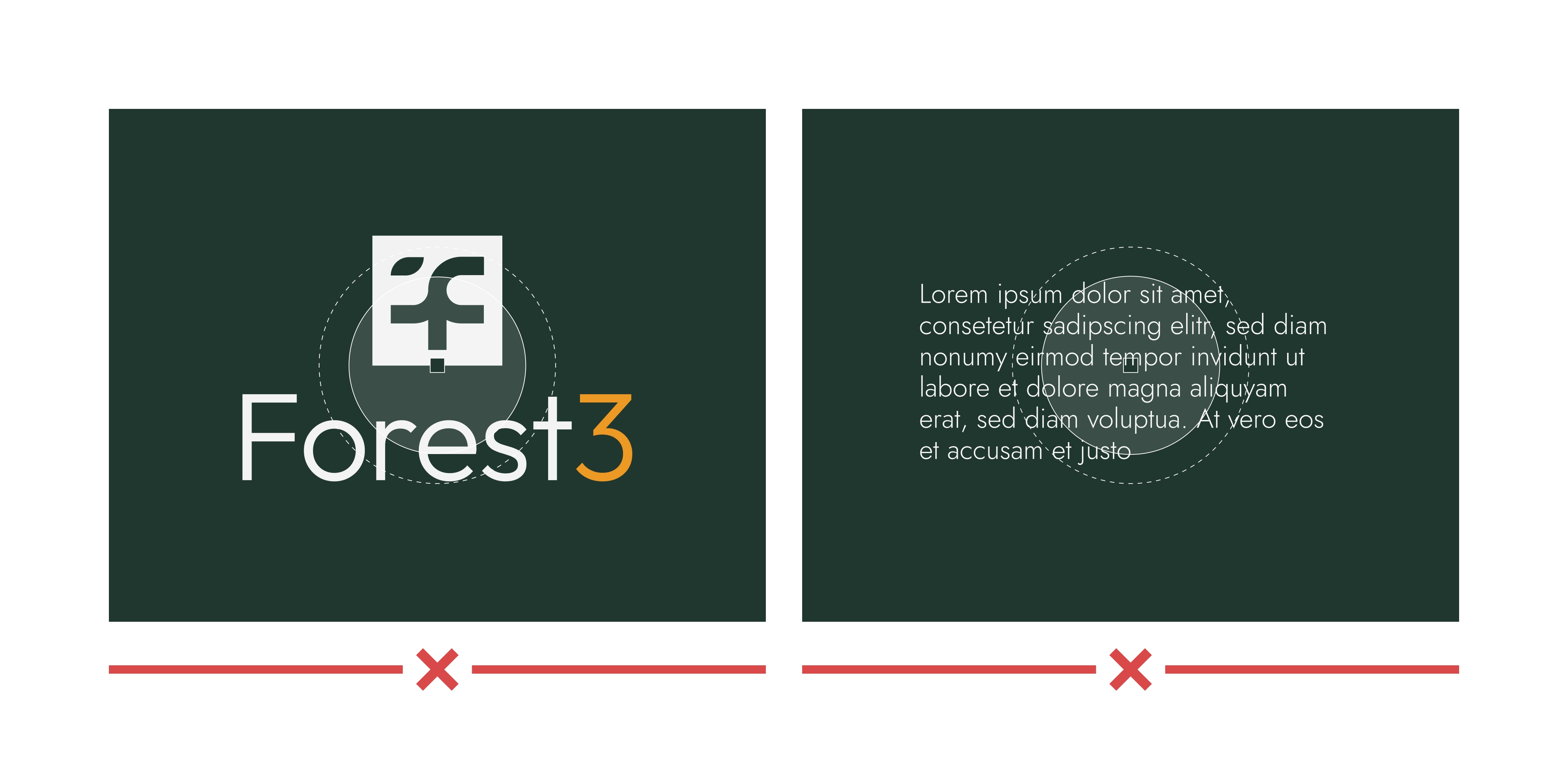
Do not place the circles directly behind text or the logo.
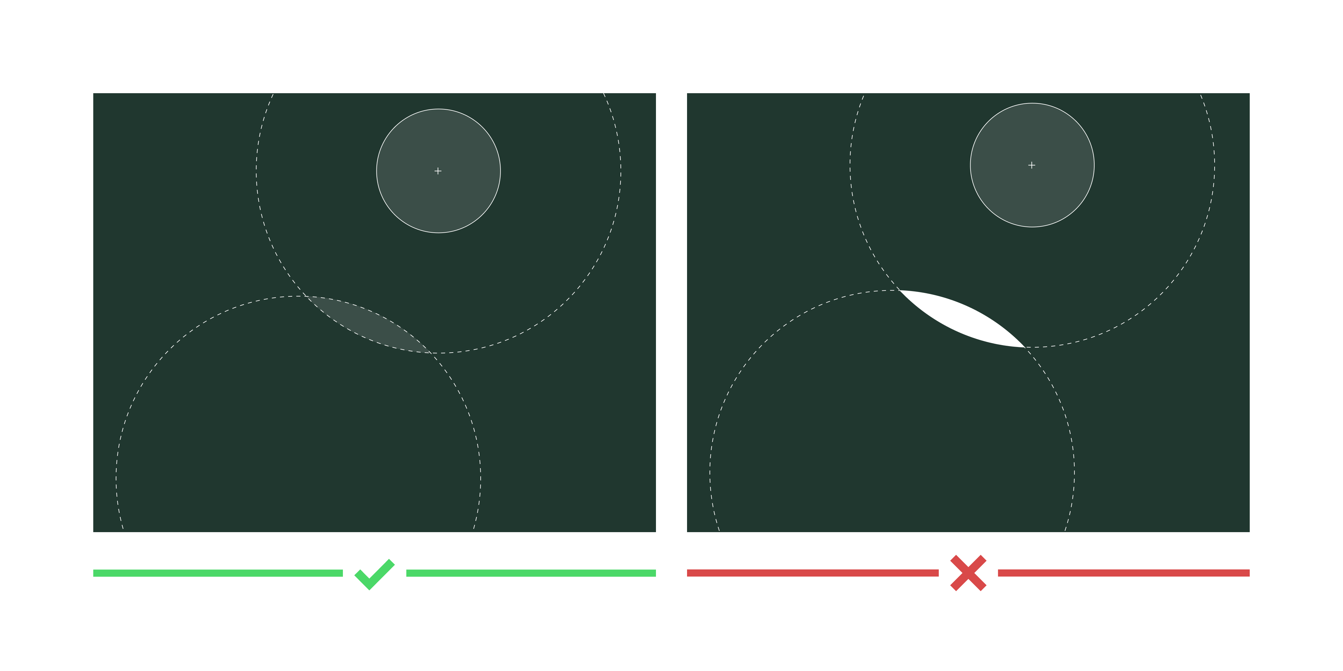
If the circles overlap, the overlapping part should be set to 12% transparency.