Download
The assets of this page for use in other programs
When you download and use any of this hubs resources, you accept the Terms & Conditions.
Typography
Typography
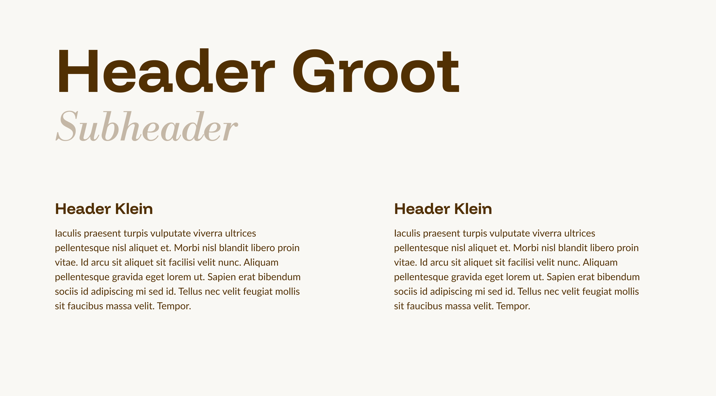
The three fonts we use for our brand are Funnel Display (Bold), Libre Bodoni (Medium Italic), and Lato.
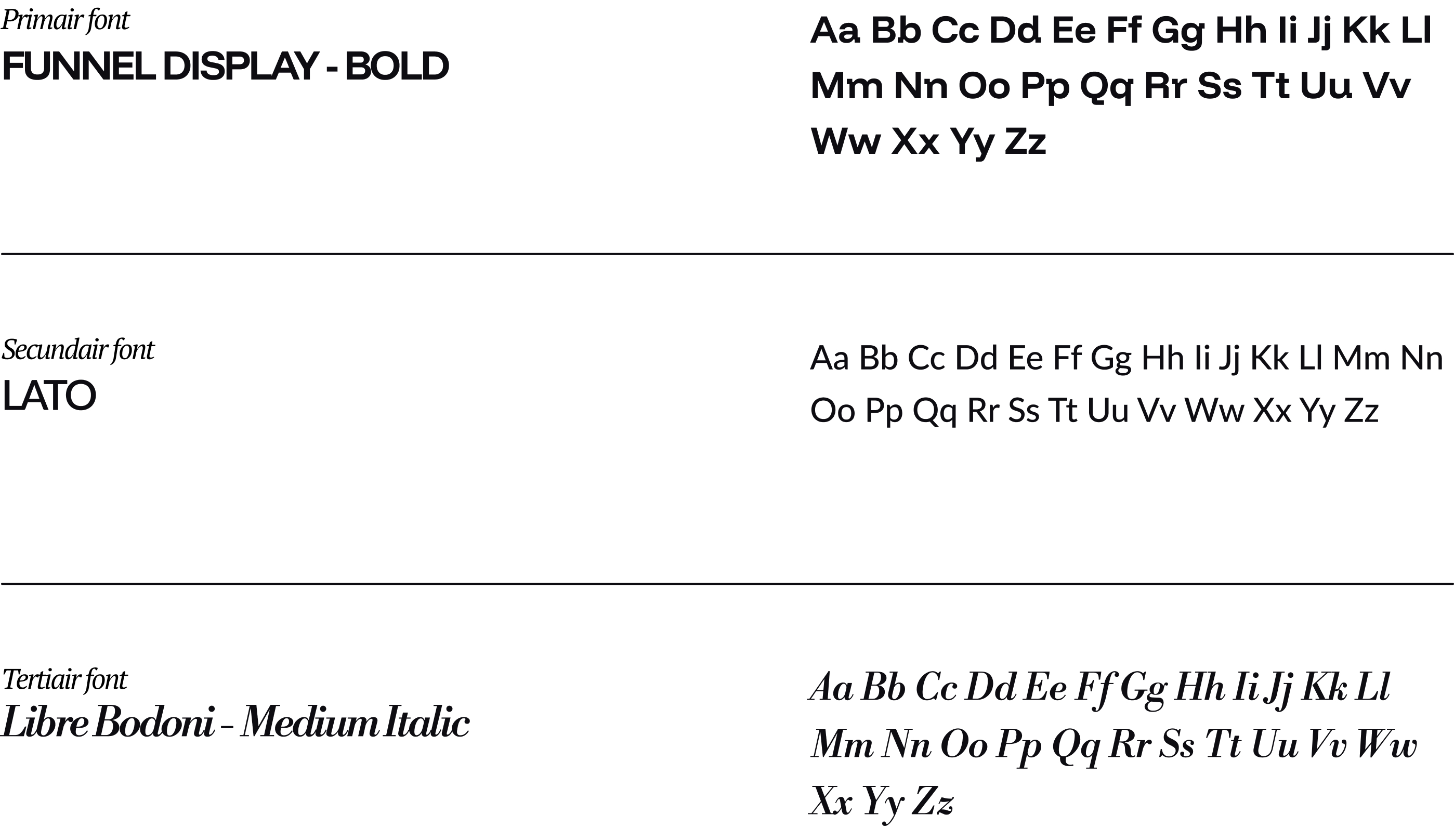
To create a clear hierarchy, it is important to use the correct typefaces in the right way.
The table on the left outlines the font applications and settings. On the right, you’ll find an example of how this looks in practice.
It is essential to follow the specified line height, letter spacing, and text layout as indicated in this document to ensure brand consistency.
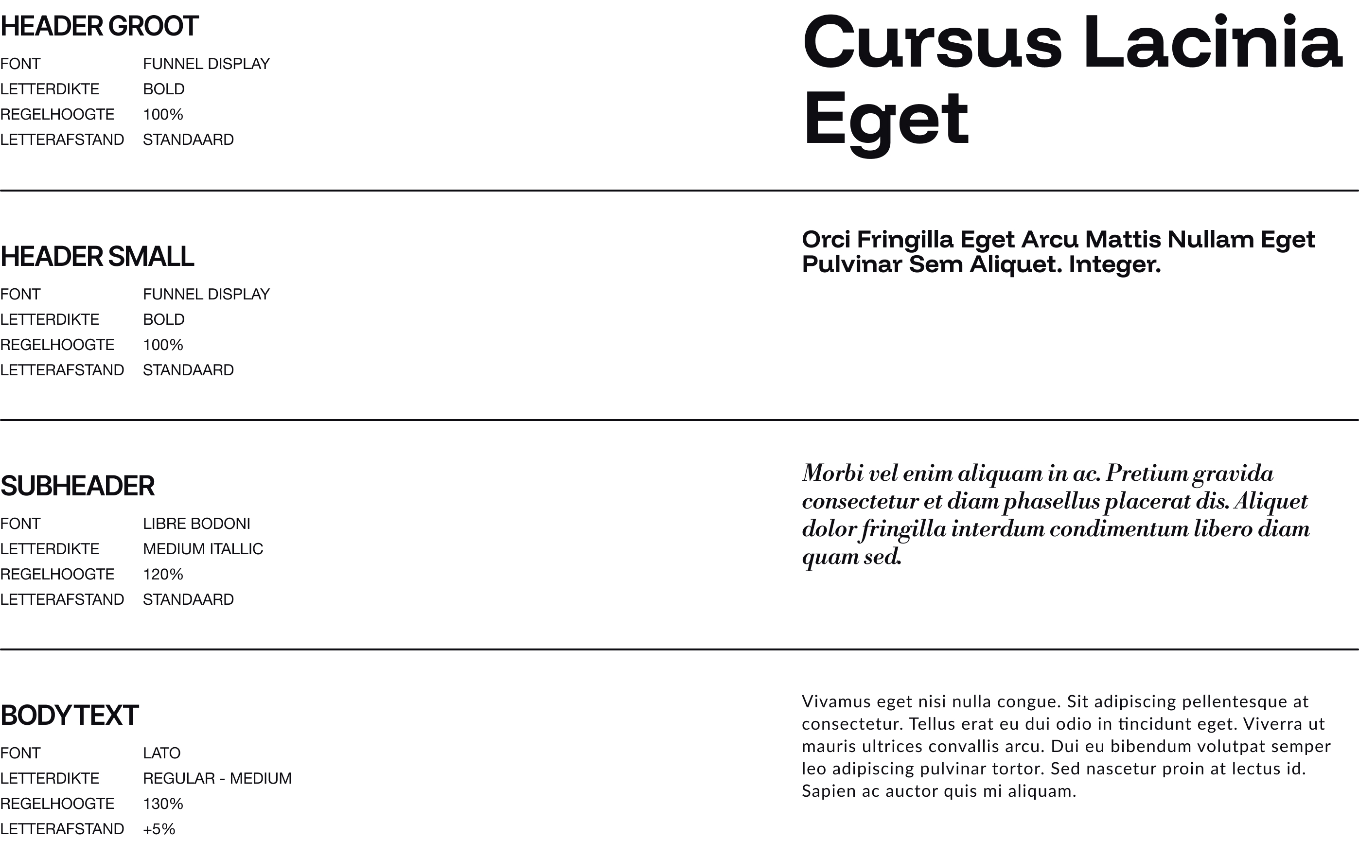
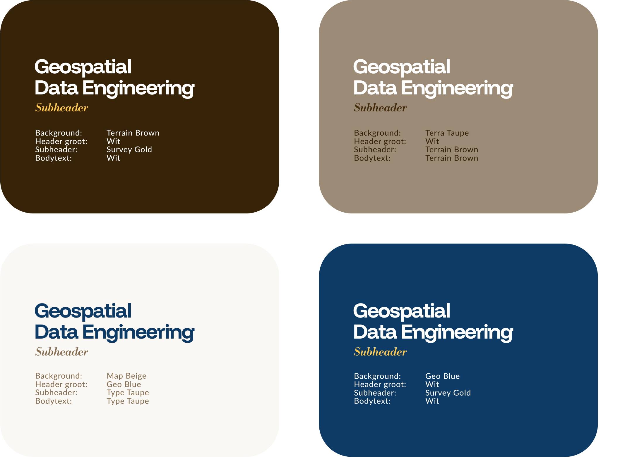
Here is an example of the discussed fonts and the visual hierarchy we apply with them.
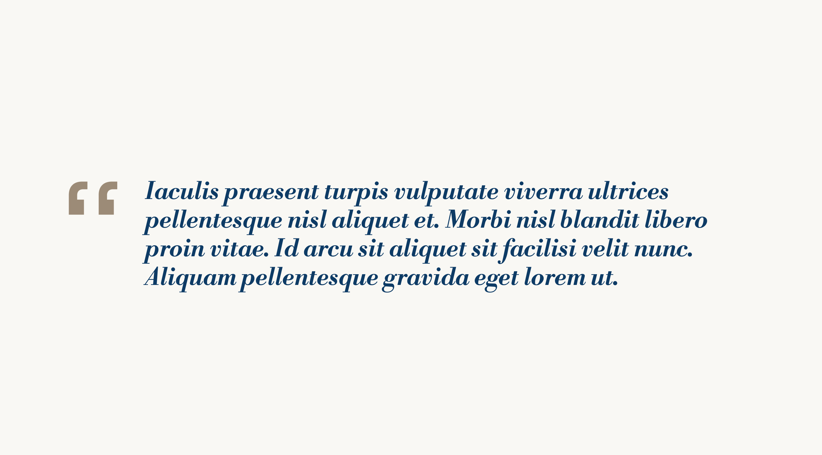
Here is an example of how to use a quote. Libre Bodoni Italic is used for the quote text, while Funnel Display is used for the quotation marks.