Download
The assets of this page for use in other programs
When you download and use any of this hubs resources, you accept the Terms & Conditions.
Colours
Colours
These are the primary colours of the Placeholder Brand.
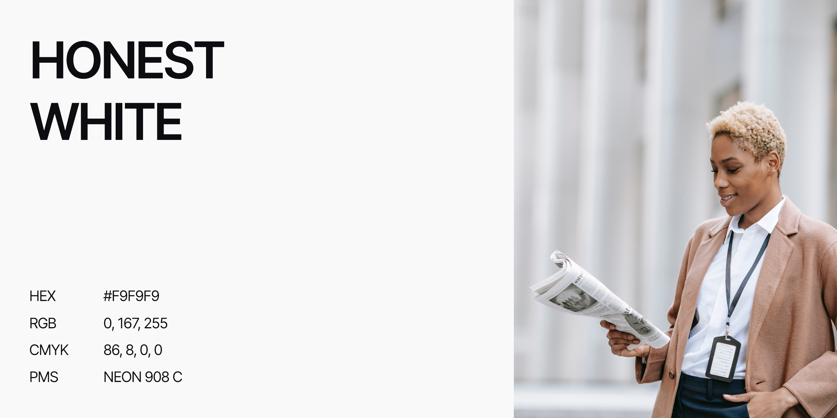
Honest White is a nuanced and subtly inviting hue that lies at the intersection of purity, authenticity, and understated elegance. This delicate shade, slightly tinted with a touch of gray achieves a remarkable balance between brightness and a matured feeling of professionalism.
The light touch of gray in Honest White softens the starkness of traditional white, adding a subtle layer of sophistication and refinement. This gentle, subdued quality makes it particularly effective for conveying a sense of calmness, sincerity and truthfulness. The colour is meant to create an immediate sense of trust and credibility in the eyes of the audience.
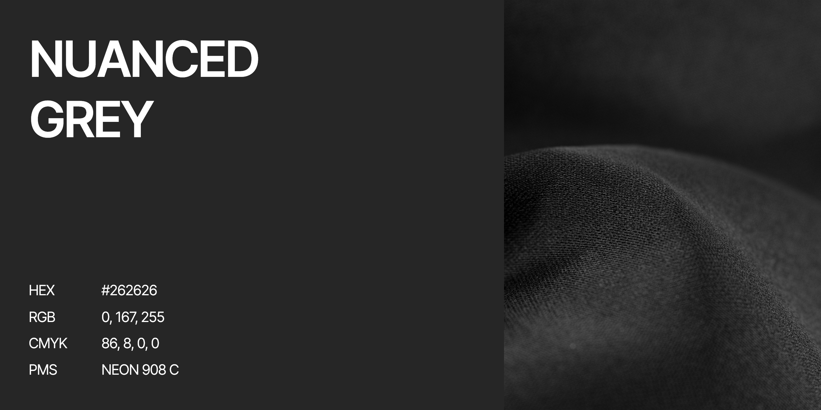
Nuanced grey is a rich and thoughtfully chosen dark hue that transcends the traditional starkness of black, imbuing the brand with an air of sophistication and depth. This refined shade of dark grey, meticulously balanced to offer subtlety and professionalism, conveys Placeholder's unwavering commitment to quality. The subtle shift from black suggests a dedication to excellence without the need for bold and overt statements.
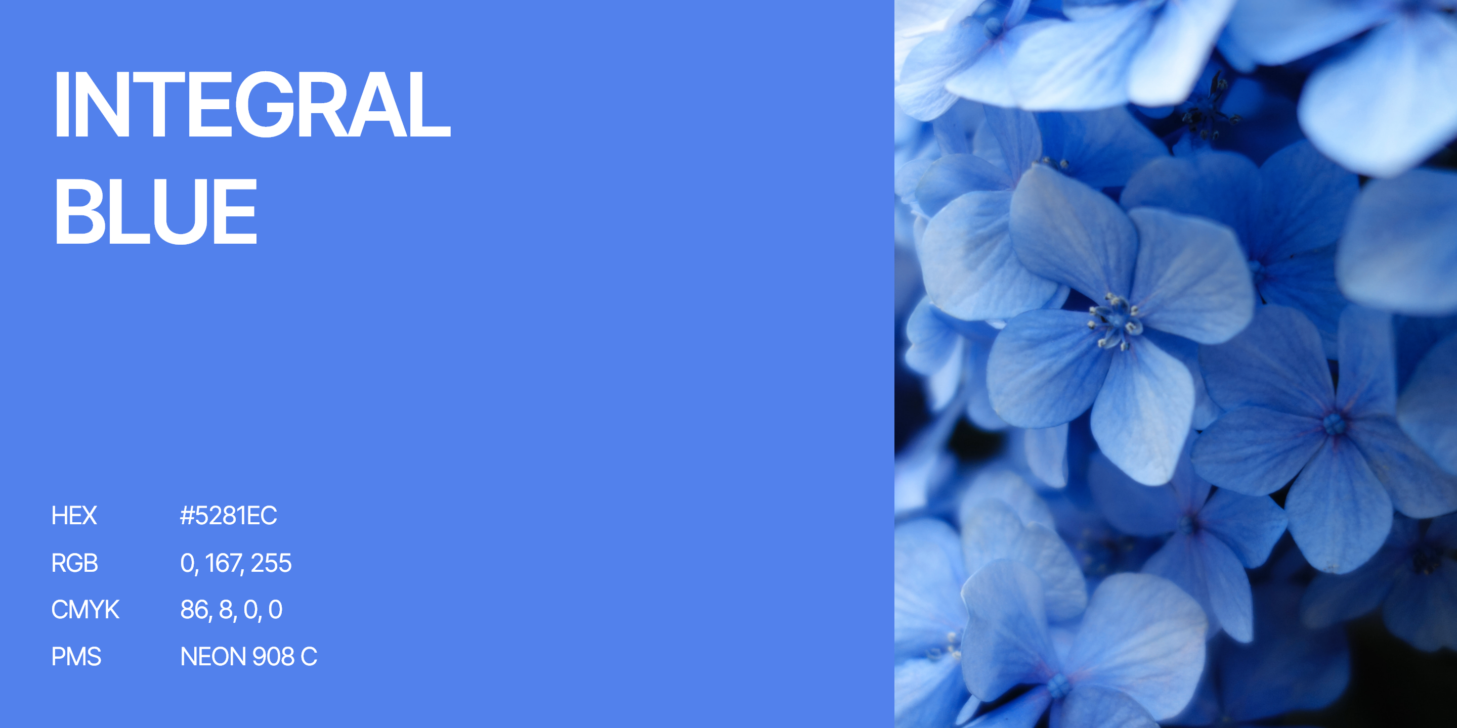
Integral Blue is a vibrant and impactful choice that encapsulates the core value of integrity. As the most distinctive colour, it embodies the essence of the brand. truthful journalism, and curiosity-driven objectivity. Its vivid presence and positive energy symbolize the curiosity and drive of it's writers in finding new authentic insights and truths, while its distinctive nature ensures that the brand's identity remains etched in the minds of the audience.
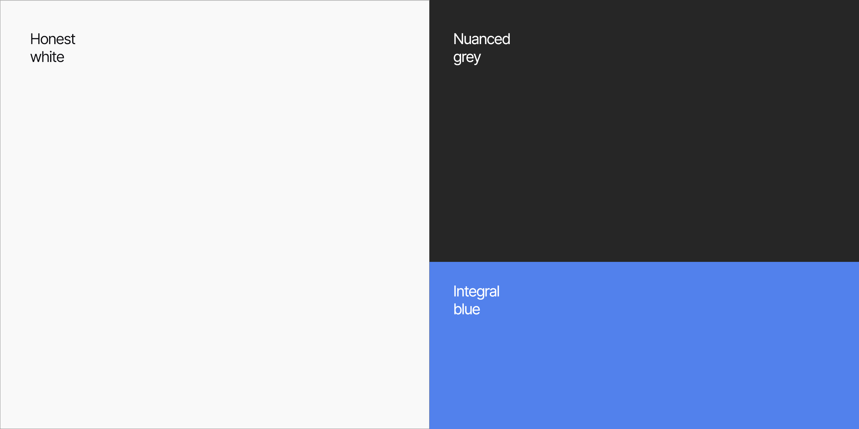
Focus on white and neutral tones. Elements that need contrast on this light colour should be put in Nuanced grey. Integral blue is used as a signal colour, which means it should only sparingly be applied in high-level visuals and interaction elements to signal something important. As the most distinctive brand colour, Integral blue serves mainly as a recognition point for the brand, as well as a tool to grab attention.